
Peintures 2010 / Graffiti Productions
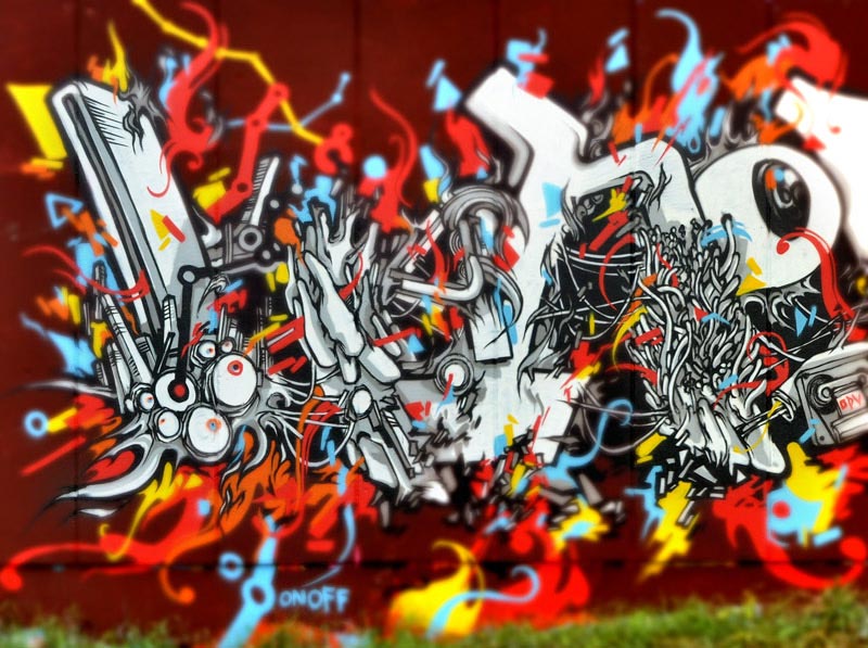
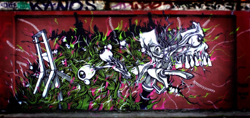
Peintures 2010 / Graffiti Productions presents a selection of graffiti murals and artistic experiments produced throughout 2010, primarily in Paris. Like the archive articles dedicated to 2008, 2009, 2011, 2012 and 2013, this post is not intended to catalogue every painting completed during the year. Instead, it gathers the projects that best illustrate the evolution of my artistic research and the visual themes that gradually became central to my work.
Looking back at these murals reveals an important stage in the development of my visual language. Many of the ideas that would later become recurring subjects already appear here in an early form. Typography becomes increasingly structured, organic textures begin to merge with architecture, and symbolic imagery starts to play a more significant role than simple graffiti lettering alone.
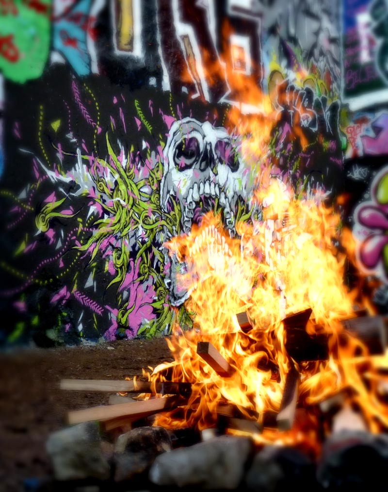
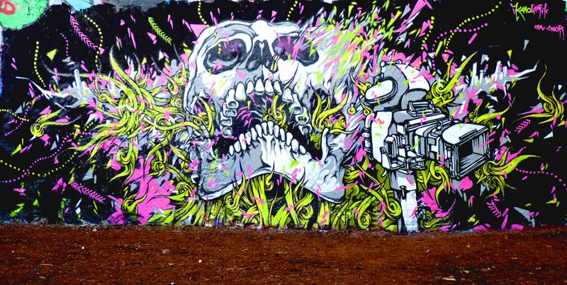
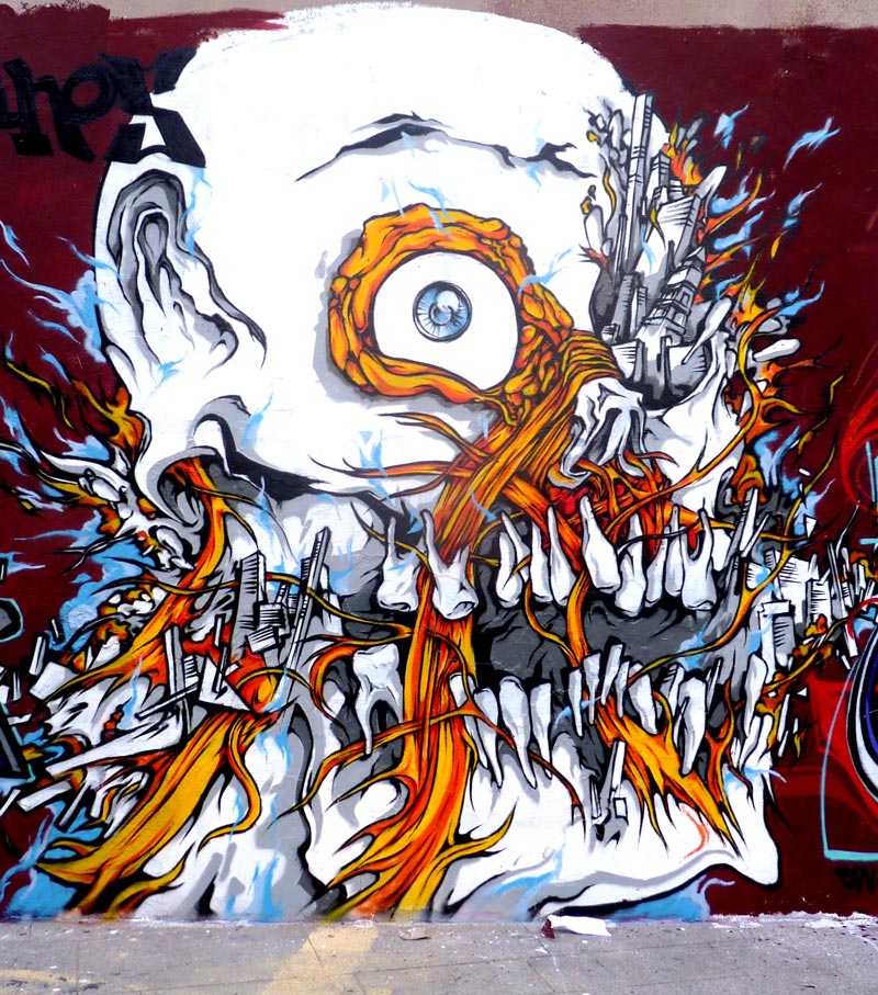
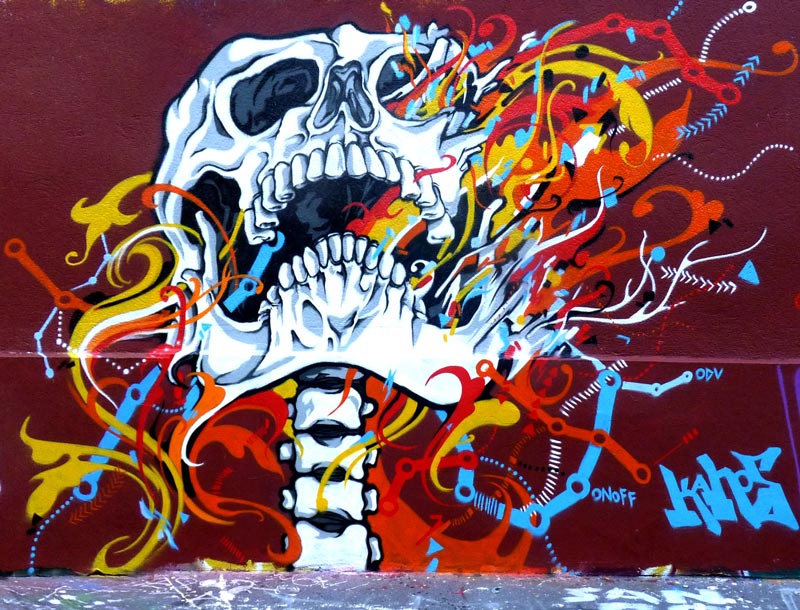
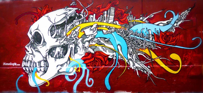
One of the most visible themes throughout this archive is the recurring presence of skulls. These figures are not used simply as decorative motifs or references to graffiti culture. They belong to a much broader visual tradition that includes the medieval Danse Macabre and the long artistic history of the memento mori. Throughout centuries, skulls have reminded viewers of the fragility of human existence and the inevitability of time.
This symbolism naturally resonates with graffiti. Like human life, graffiti is temporary. Walls are repainted, demolished or renovated, and artworks gradually disappear beneath new layers of paint or changing urban landscapes. The skull therefore becomes a metaphor not only for mortality but also for the ephemeral nature of artistic intervention within the city.
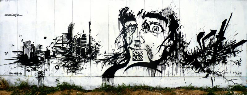
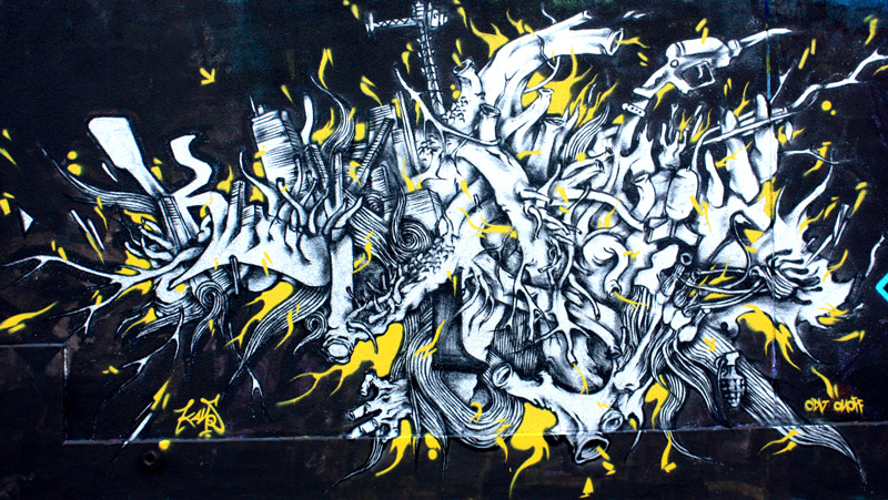
Several murals also demonstrate an increasing interest in black-and-white compositions. By reducing the colour palette, I sought to move closer to graphic design while preserving the energy and spontaneity of graffiti. Removing colour places greater emphasis on typography, composition and visual rhythm, allowing the structure of the work to become more prominent.
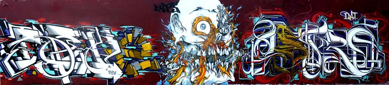
Typography itself becomes a central area of experimentation. Rather than functioning only as my artist name, the letters evolve into graphic constructions capable of carrying conceptual ideas. This approach progressively moves graffiti beyond its traditional framework and establishes stronger connections with editorial design, poster design and illustration.
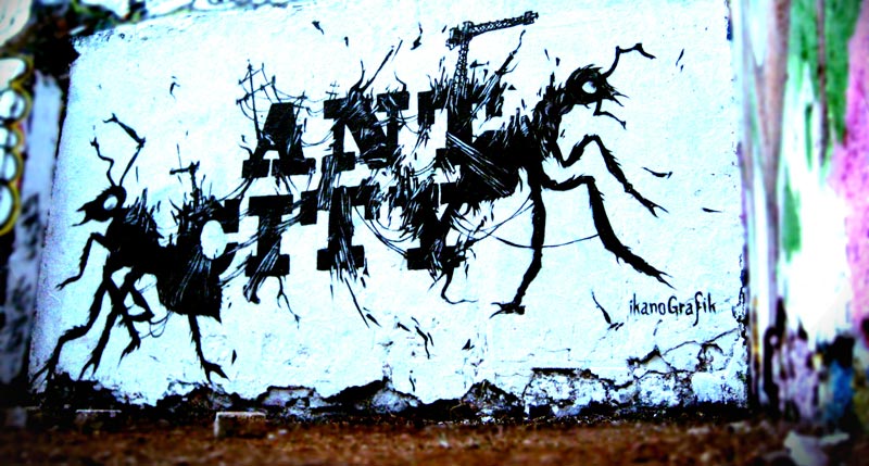
One example included in this archive is Ant City. This painting explores the relationship between individuals and the urban environment through a simple metaphor. The title suggests that cities function like giant anthills in which human beings become worker ants, constantly constructing, maintaining and expanding increasingly complex urban systems.
Rather than illustrating this concept literally, the composition uses typography and visual structure to evoke ideas of organisation, repetition and collective activity. It reflects an ongoing interest in understanding cities as living systems that continuously transform both their physical environment and the people who inhabit them.
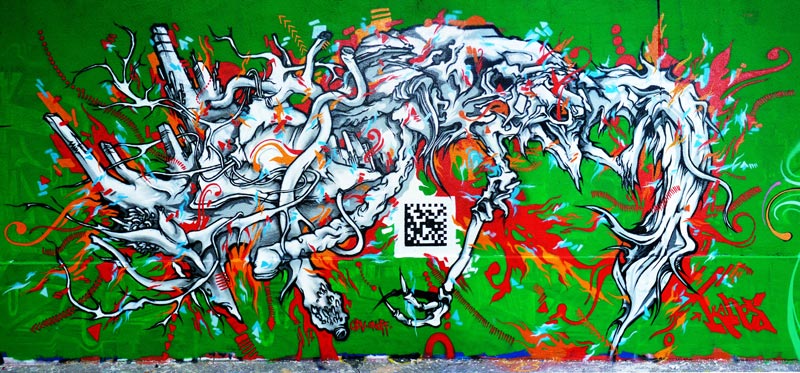
Another remarkable aspect of this period is the integration of digital technology into graffiti. One mural incorporates a QR code linking directly to my website. At the time, QR codes were still extremely uncommon in public space and had not yet become part of everyday visual culture.
Including one within a graffiti mural was therefore an experiment that connected traditional spray painting with emerging digital communication. The wall no longer functioned only as a physical object but also became an interactive gateway between urban space and the internet. Looking back today, this early integration anticipated developments that would later become widespread across advertising, design and public communication.
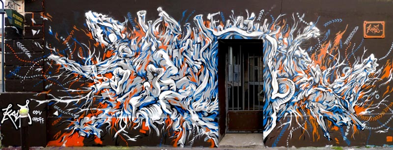
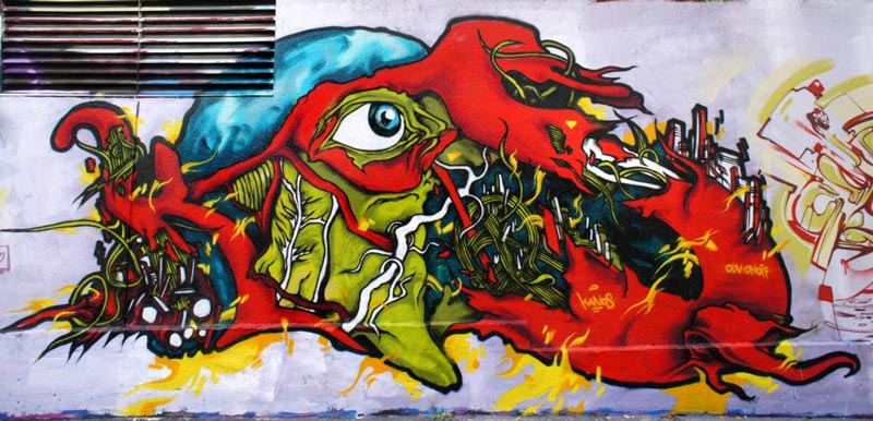
Alongside typography and symbolic imagery, organic forms continue to expand throughout the paintings. Muscular tissues, veins, anatomical fragments and biological textures merge with architectural structures and urban fragments. Rather than opposing the organic and the constructed, these compositions suggest that cities themselves behave like living organisms.
Buildings appear connected by vascular systems, while graffiti lettering gradually absorbs biological structures. This visual language reflects one of the recurring concepts developed throughout my work: the city constantly consumes, transforms and regenerates itself. Urban environments digest buildings, industrial sites and even graffiti, leaving only traces behind.
Several of these ideas would later be expanded in projects dedicated to industrial landscapes, urban mutation and the Kanos le billet d’un dollar series. Seen retrospectively, the paintings gathered in Peintures 2010 represent an important transitional stage where multiple research directions begin to converge into a coherent artistic language.
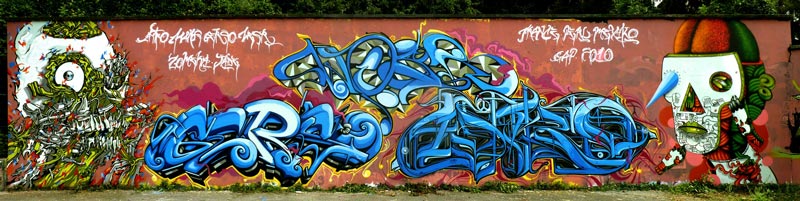
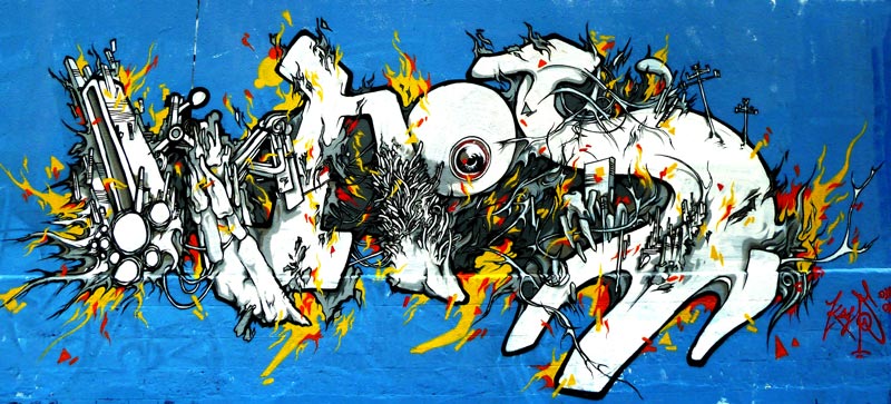
Among the works presented in this archive is also the blue-background mural that would later become the cover image of the influential graffiti magazine Paris Tonkar. Its publication marked an important moment of visibility within the graffiti community and contributed to documenting a period of Parisian graffiti that has since largely disappeared through the transformation of the city’s walls.
Viewed together, the works presented in Peintures 2010 illustrate a year of intense experimentation. They document the progressive emergence of themes that would continue to shape my artistic practice for many years: urban transformation, the passage of time, organic and mechanical hybridisation, conceptual typography and the fragile, temporary nature of graffiti itself.
Frequently Asked Questions
What is Peintures 2010 / Graffiti Productions?
It is an archive showcasing a selection of my most significant graffiti murals created during 2010, mainly in Paris.
Why do skulls appear so often in these paintings?
They reference the medieval Danse Macabre and memento mori, symbolising both human mortality and the temporary nature of graffiti.
Why did you include a QR code in one mural?
It was an early experiment linking graffiti with digital media by connecting the wall directly to my website.
What themes define the 2010 archive?
The works explore typography, urban mutation, organic and mechanical forms, architecture and the passage of time.
How does this archive connect to your later work?
It introduces many of the visual ideas that would later develop in projects such as Kanos le billet d’un dollar, industrial dystopias and other urban research series.