
CROQUIS FRAME AND WORD / Black & White Bic Pen Sketches – Typography and Word-Based Composition (2010)
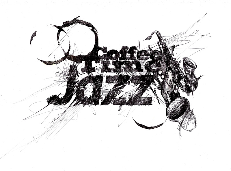
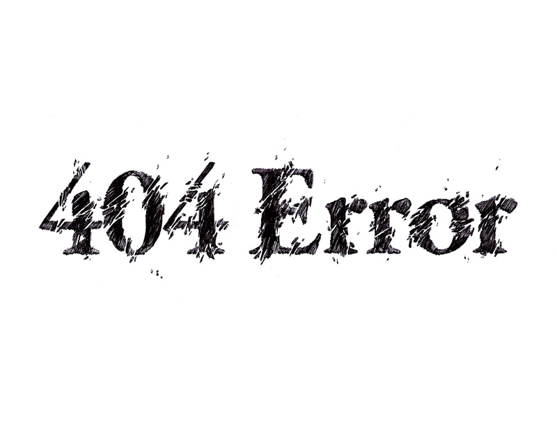
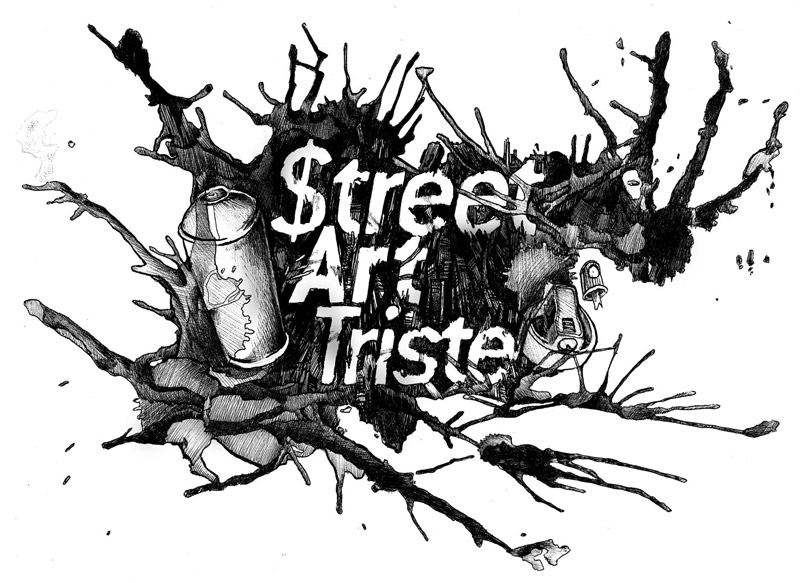
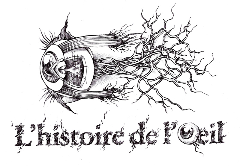
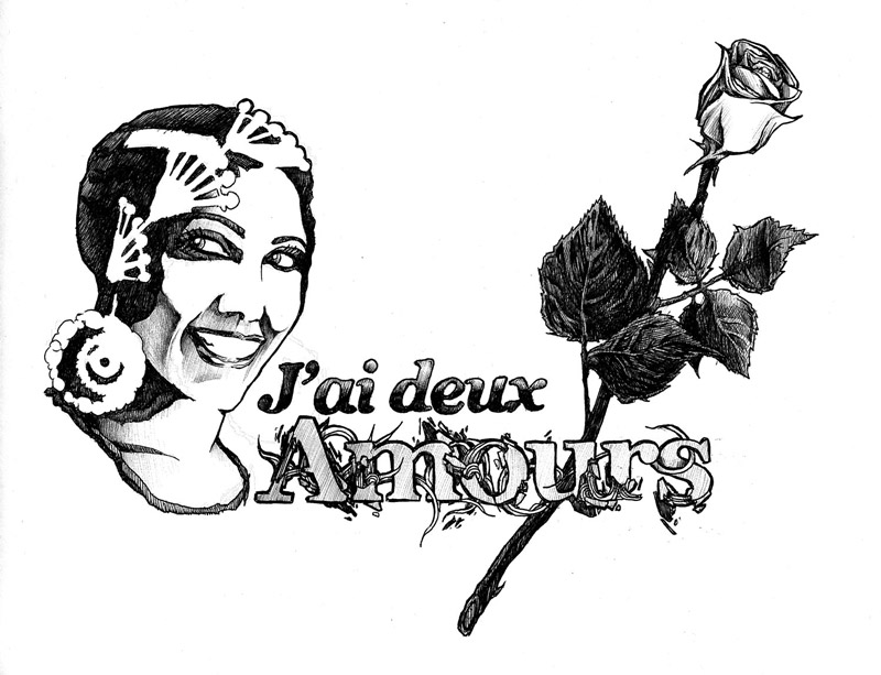
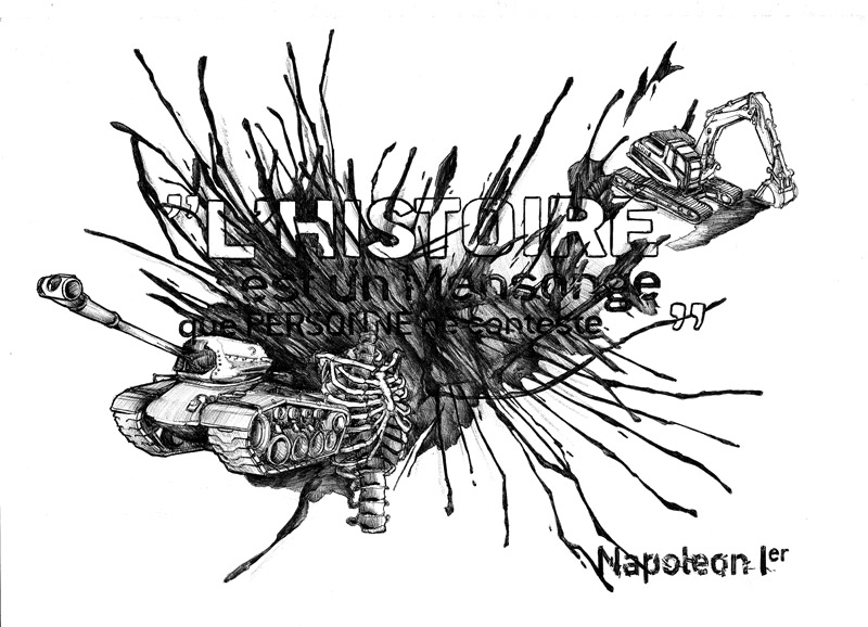
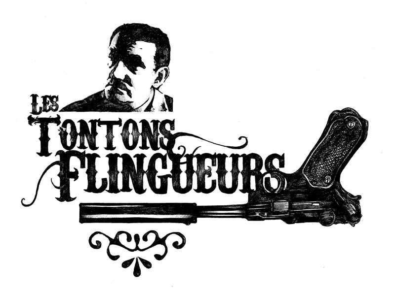
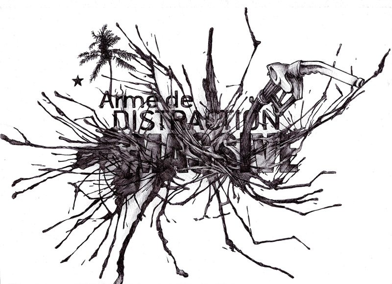
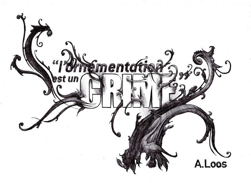
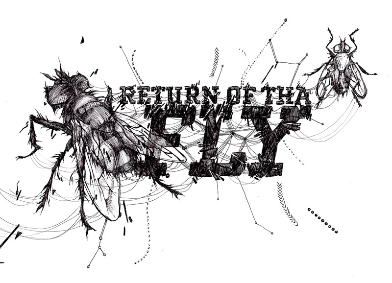
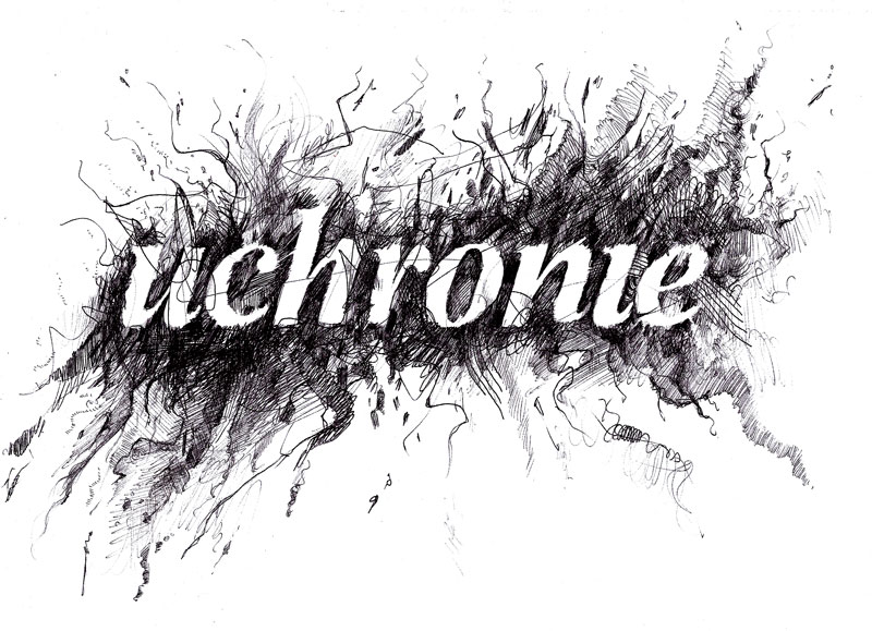
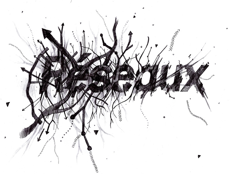
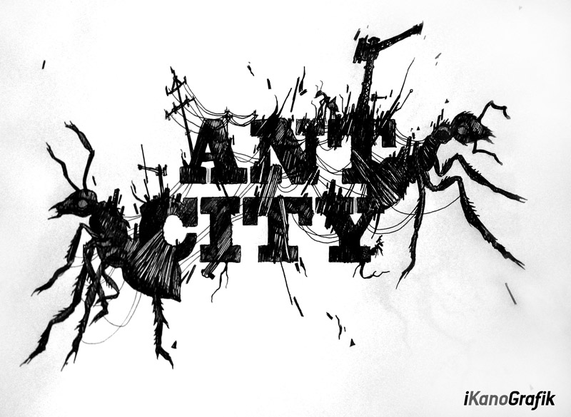
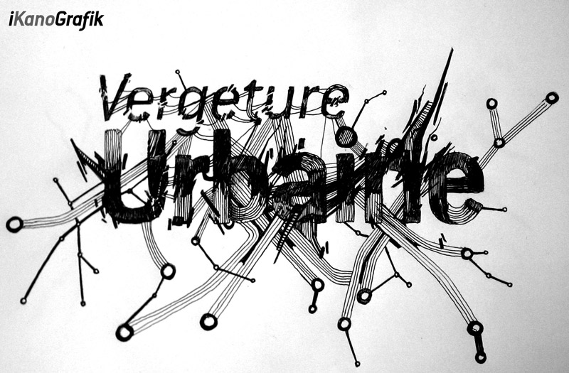
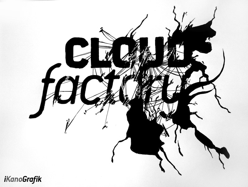
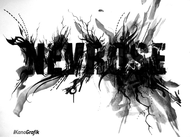
Croquis Frame & words / These black and white sketches created by Alex Kanos in 2010 represent an early exploration of drawing using Bic pen as a direct and immediate medium. The works focus on the construction of visual meaning through words, typography and graphic composition rather than traditional figurative representation.
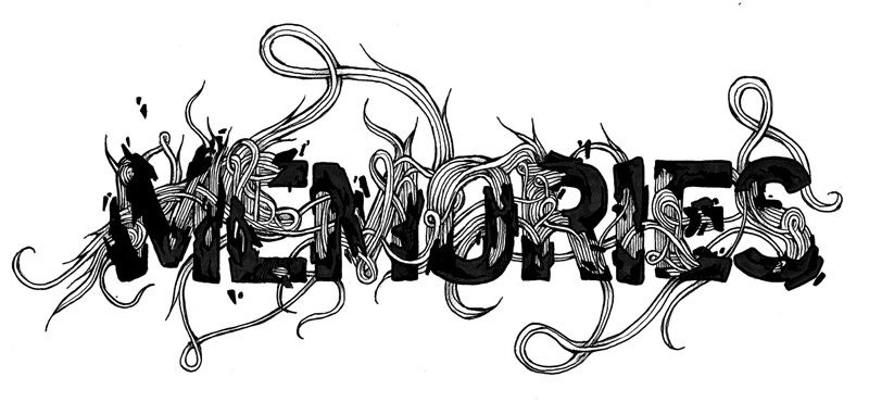
In this series, language is treated as a raw visual material. Words are not only carriers of meaning but also structural elements used to build composition. Letters are fragmented, repeated, layered or transformed to generate rhythm, tension and spatial organization within the drawing surface.
The use of black ink reinforces the intensity and clarity of the visual language. Without color, the focus shifts entirely to contrast, line quality and density. This limitation becomes a creative constraint that pushes the drawings toward a more conceptual and structural approach.
Typography in these sketches is not used in a functional or readable way. Instead, it becomes an abstract system where text is deconstructed and reorganized into new visual forms. Some compositions suggest fragmented messages, while others transform words into almost architectural structures.
The drawings often combine written elements with abstract graphic shapes. These elements interact within the same space, creating layered compositions where meaning is unstable and constantly shifting. The viewer is confronted with partial readability, where text oscillates between communication and pure form.
A strong characteristic of this series is its dark visual aesthetic. The density of ink, the accumulation of lines, and the fragmentation of forms create a sense of tension and visual intensity. These sketches explore a space between order and chaos, where structure emerges from repetition and disruption.
The Bic pen, as a simple and everyday tool, plays an important role in the immediacy of the process. It allows no correction, which reinforces the directness of the gesture. Each line is final, creating a raw and uncompromising visual language. This immediacy contributes to the energy and authenticity of the compositions.
These sketches also reflect an early research phase into visual language systems. Rather than illustrating external subjects, the work focuses on how meaning can be constructed through the interaction of text, form and space. This approach positions drawing as a form of thinking rather than representation.
The relationship between typography and composition is central. Words become structural units, while space becomes a field of tension. The balance between legibility and abstraction is constantly negotiated, creating works that exist between communication and visual experimentation.
This series of Bic pen drawings forms an important foundation in the development of Alex Kanos’ artistic practice. It establishes early concepts that will later evolve into more complex works involving urban environments, industrial structures and large-scale visual systems.
Croquis Frame and words / also called “Black & White Typographic Sketches 2010” therefore represent a critical moment of experimentation where language, drawing and structure converge into a single visual process.
Frequently Asked Questions
What are these Bic pen sketches from 2010?
They are black and white drawings by Alex Kanos exploring typography, words and graphic composition using Bic pen.
What is the main concept of this series?
The series explores how language and typography can be used as visual and structural elements in drawing.
Why use Bic pen for these sketches?
The Bic pen creates direct, irreversible lines that emphasize immediacy and raw expression.
Are the words readable in these drawings?
Not always. Words are often fragmented, abstracted or reorganized into visual compositions.
What style defines these works?
A dark, graphic and experimental illustration style combining typography and abstract composition.