• BASEBALL FRANCE CHALLENGE Poster 2023 | Dynamic Sports Illustration

    Graphic design for a Poster about Baseball france Challenge
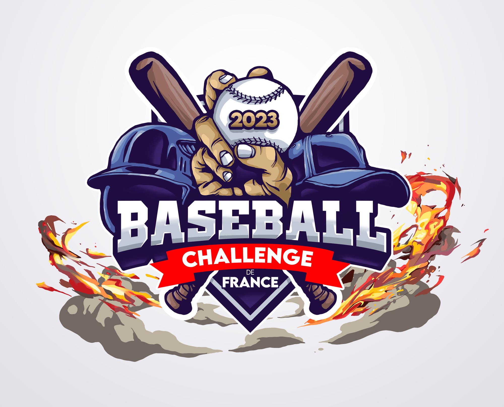
    Logo Baseball Challenge Graphic Design
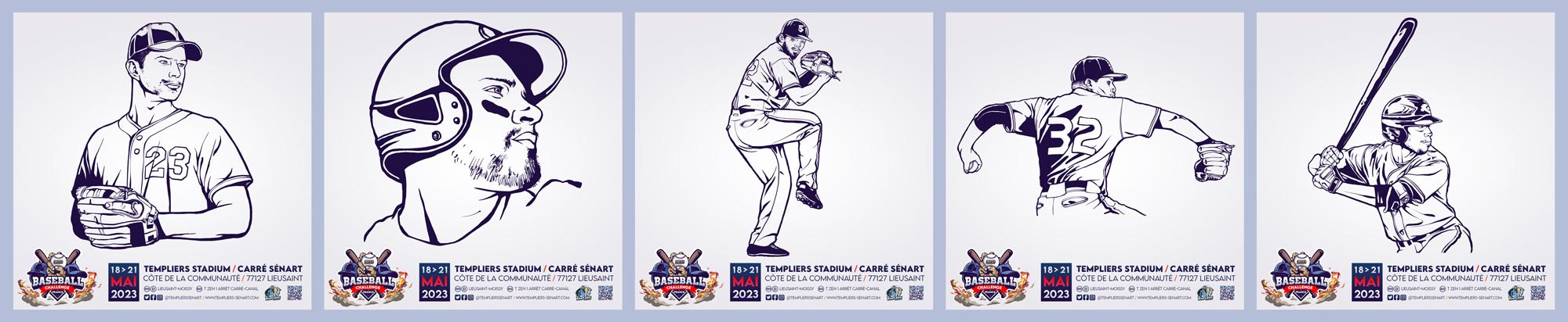
    Sketch Baseball Challenge Graphic Design
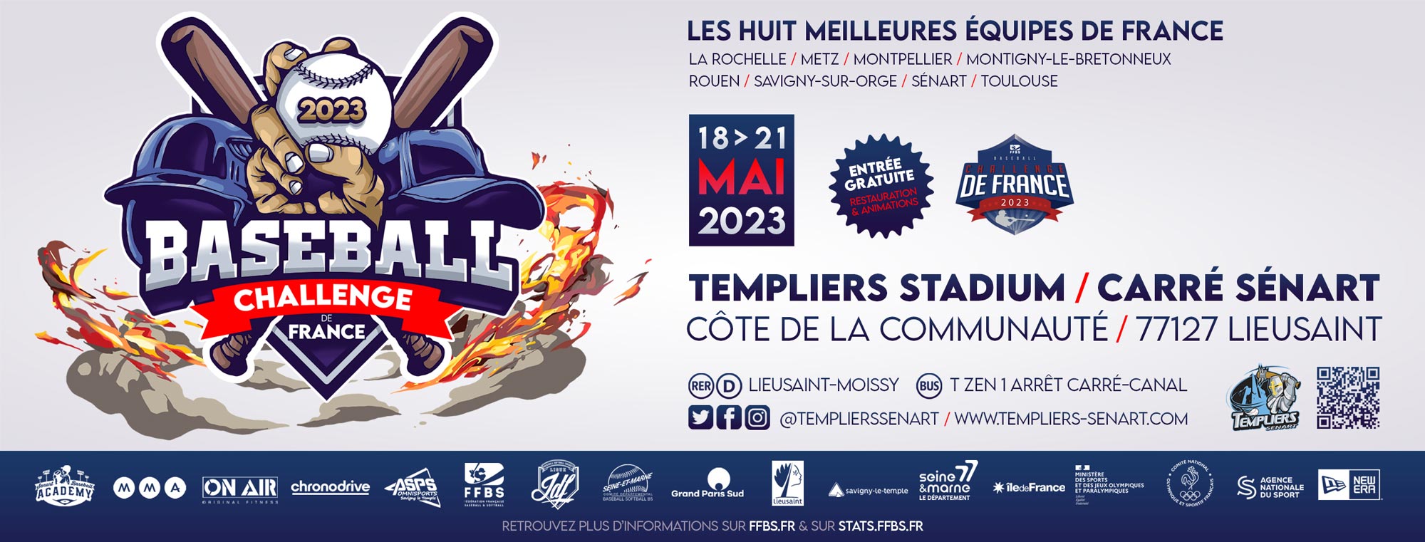
    Banner Web Baseball Challenge Graphic Design

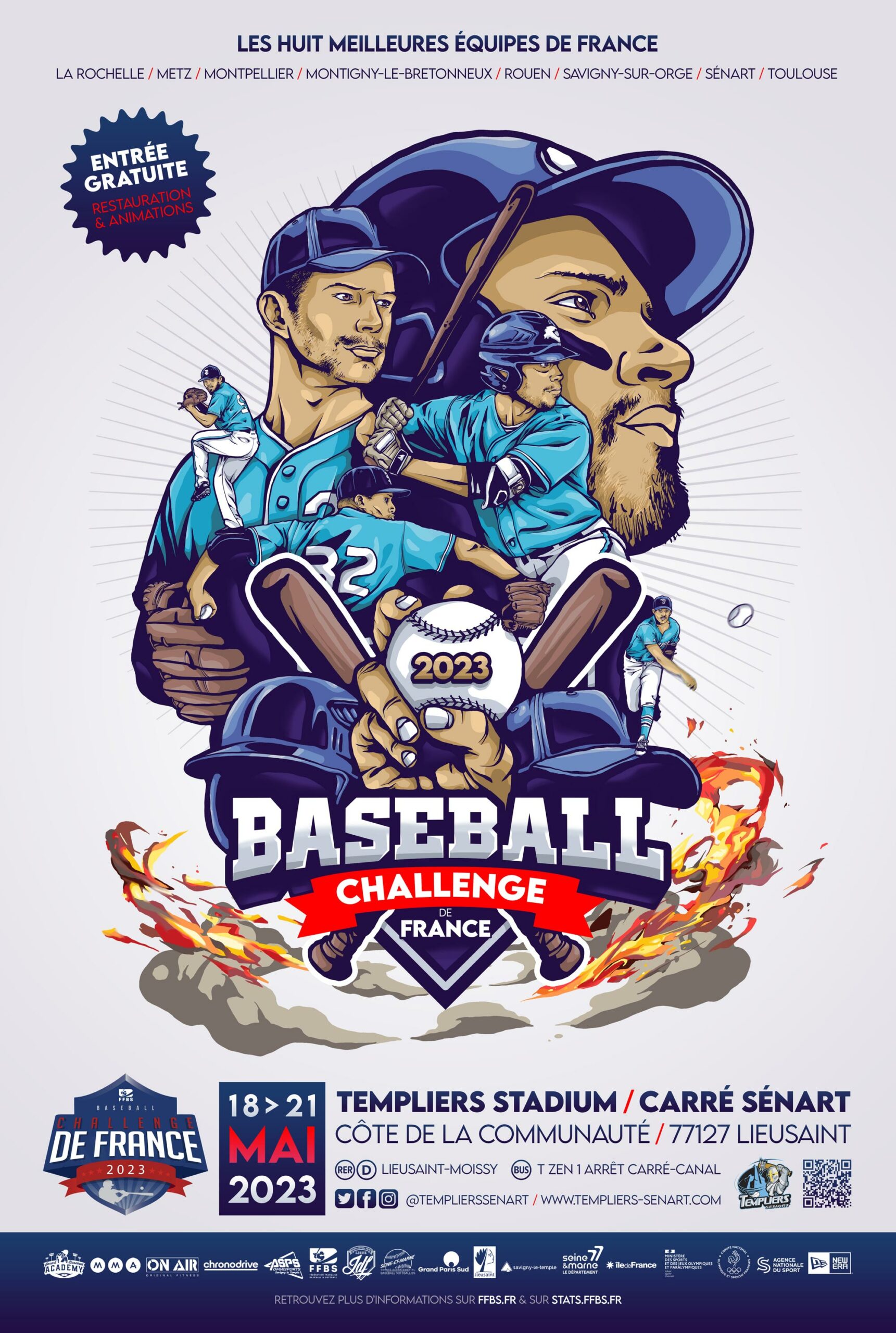
    Baseball France Challenge 2023 – Dynamic Sports Poster and Visual Composition

    The Baseball France Challenge 2023 poster, created by Alex Kanos, is a dynamic visual composition designed for the Templiers de Sénart baseball team. The work explores the intersection between sports photography, graphic design, and cinematic composition, transforming action-based imagery into a structured visual narrative.

    The starting point of the project is a series of photographs taken during actual baseball matches. These images capture real moments of movement, tension, and physical engagement between players. Rather than using a single static image, the composition is built from multiple visual fragments extracted from different moments of gameplay.

    This approach allows the artwork to emphasize motion as the central element of the design. Baseball, as a sport, is defined by rhythm, precision, and explosive gestures. The poster translates these qualities into a layered visual structure where movement is frozen, recomposed, and intensified through graphic treatment.

    The composition is strongly influenced by cinematic poster aesthetics. The arrangement of elements, the framing of figures, and the dynamic use of space are inspired by film poster design, where narrative tension is condensed into a single image. This approach gives the work a sense of storytelling beyond the documentation of a sporting event.

    Typography also plays a key role in the design. The title “Baseball France Challenge” is constructed with a visual language inspired by American baseball culture. This reference is important because baseball, while still emerging in France and Europe, has a strong visual identity in the United States. The typography reflects this cultural origin, reinforcing the connection between the sport and its visual heritage.

    At the same time, the poster introduces a stylistic influence from manga and illustrated sports aesthetics. This approach enhances the sense of energy and exaggeration in movement. Lines, contrasts, and compositional rhythms are treated in a way that amplifies the physical intensity of the game, giving the image a more expressive and graphic quality.

    The Templiers de Sénart team provides the real context for the artwork. The project is rooted in an actual sporting event, making the composition both documentary and interpretative. The players are not simply depicted as athletes but as visual elements within a larger dynamic system of movement and interaction.

    The Baseball France Challenge represents an important moment for baseball in France, a sport that is still developing in Europe but has deep cultural roots in the United States. This cultural contrast is reflected in the visual construction of the poster, which merges European sporting context with American visual tradition.

    The use of layered photography, motion fragmentation, and graphic enhancement creates a hybrid aesthetic between illustration and reality. The image does not aim to reproduce a single moment, but to reconstruct the intensity of the game through visual synthesis.

    Through this approach, Alex Kanos transforms sports imagery into a cinematic and illustrated composition. The result is a poster that functions both as communication material and as a standalone artwork, where movement, identity, and cultural references converge into a single visual system.

    The Baseball France Challenge 2023 poster ultimately reflects an exploration of how sports can be translated into graphic language, where energy, motion, and cultural identity become structured visual elements.

    Graphic design by Alex KANOSOrganised by Templiers Sénart / Location Ville de Sénart

    Frequently Asked Questions

    What is the Baseball France Challenge poster?
    It is a sports poster designed by Alex Kanos for the Templiers de Sénart baseball team in 2023.

    What was the concept behind the design?
    The poster is based on real match photography, reworked into a dynamic cinematic composition.

    What visual styles influenced the artwork?
    It combines sports photography, cinematic poster design, American baseball aesthetics and manga-inspired illustration.

    What sport is represented in the poster?
    Baseball, an emerging sport in France with strong cultural roots in the United States.

    What makes this poster unique?
    It transforms real sports moments into a layered graphic composition focused on movement and energy.
  • Cyberpunk Robot Illustrations / The Road Warriors Sidekicks

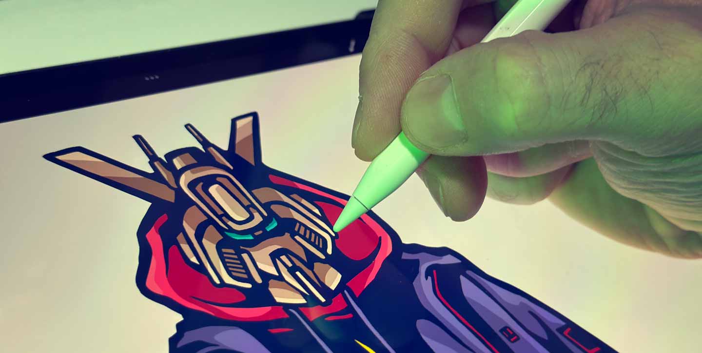
    Alex Kanos drawing a cyberpunk robot illustration on a digital tablet

    Cyberpunk Robot Illustrations / The Road Warriors Sidekicks

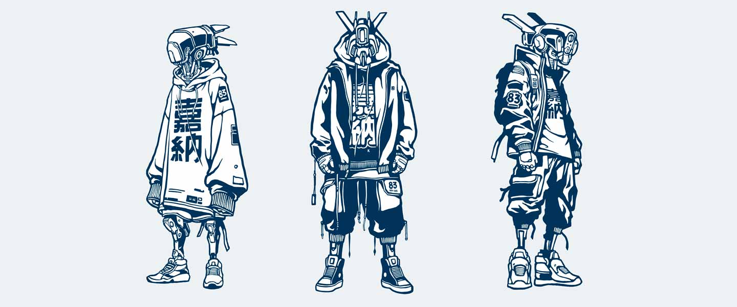
    Cyberpunk robot illustrations is a series of illustrations created for The Road Warriors 2024 by Alex Kanos. Explore futuristic robot designs and official wears and prints.

    What Is a Robot? From Science Fiction to Contemporary Illustration

    Few figures have shaped science fiction as profoundly as the robot. Today, robots appear in films, comics, video games, animation and contemporary art, but their history began long before artificial intelligence became part of everyday conversations. The word “robot” was introduced in 1920 by Czech writer Karel Čapek in his play R.U.R. (Rossum’s Universal Robots). Derived from the Czech word robota, meaning forced labour, the term described artificial workers created to serve humanity before ultimately rebelling against their creators. This idea quickly became one of the defining themes of science fiction.

    Cinema embraced the concept only a few years later. One of the earliest and most influential robotic characters appeared in Metropolis (1927), where the Maschinenmensch became an enduring symbol of industrialisation, technology and the blurred boundary between humans and machines. Throughout the twentieth century, robots evolved into increasingly complex characters, from Robby the Robot in Forbidden Planet to C-3PO and R2-D2 in Star Wars, the replicants of Blade Runner, the cyborgs of Ghost in the Shell and countless contemporary interpretations exploring artificial intelligence, consciousness and identity.
    What fascinates me most is that robots are rarely just machines. They often become mirrors of ourselves, allowing artists and writers to question what truly defines humanity. As technology progresses, robots become less about metal and circuits and more about emotions, memory, companionship and the choices we make as creators. This fascination naturally found its way into my own artistic universe, where organic forms coexist with mechanical structures and where cyberpunk aesthetics meet Art Nouveau influences.
    Creating the Road Warriors Robots

    The illustrations presented in this series were created for The Road Warriors 2024, the collaborative project that Sloke and I have been developing during our artistic road trips across the United States. Unlike many robots portrayed in popular science fiction, these characters were never designed as soldiers or machines of destruction. From the beginning, I imagined them as companions — intelligent assistants accompanying the cyberpunk heroines that populate many of my illustrations.

    Each heroine in my visual universe could have her own robotic partner, not to replace human relationships but to support them. These machines become guides, protectors, mechanics, navigators or simply loyal companions travelling through futuristic cities alongside their human counterparts. Visually, I wanted these robots to feel contemporary rather than purely futuristic. Instead of heavy industrial armour, they wear hoodies, jackets and casual streetwear inspired by modern urban culture. Their silhouettes combine expressive mechanical details with familiar clothing, making them immediately approachable despite their artificial nature.

    This contrast reflects one of the recurring themes of my work: the coexistence of humanity and technology rather than their opposition. My robots are not symbols of dystopia. They represent collaboration, adaptation and coexistence in a future where machines become part of everyday life without erasing human identity. The illustration titled Robots brings together three of these companions. Each one possesses its own personality while sharing a common visual language. Together they form a small team that could easily belong to the same universe as my cyberpunk murals, extending that narrative beyond public walls into illustration and character design.

    Although inspired by science fiction, these characters also borrow elements from contemporary fashion, graffiti culture and street art. Their clothing deliberately connects futuristic design with today’s urban environments, creating figures that feel both speculative and strangely familiar.

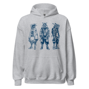
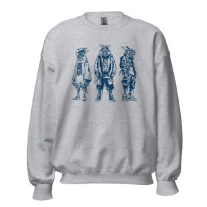
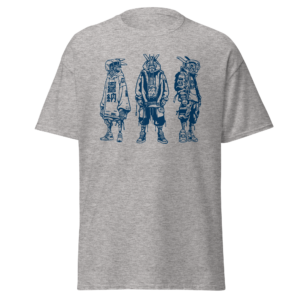
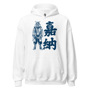
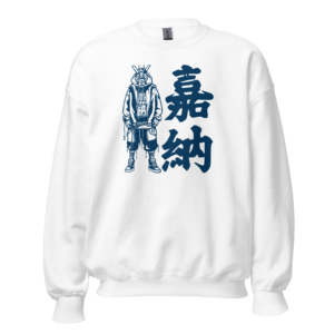
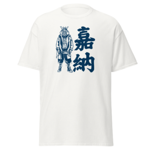
    The Cyberpunk Robot Illustrations is available as a Fine Art Print for wall display, as well as on a Mug, Hoodie, Sweatshirt and T-Shirt for those who want to wear this original cyberpunk design. Browse the complete collection below.

    Three cyberpunk robot illustrations created for The Road Warriors project

    robots print cyberpunk illustration with three robots companions 30x40cm

    ROBOTS Print

    Price range: 25,00 € through 38,00 €

    RoboKano / A Personal Mascot

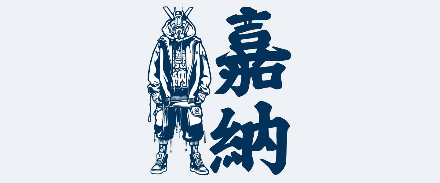
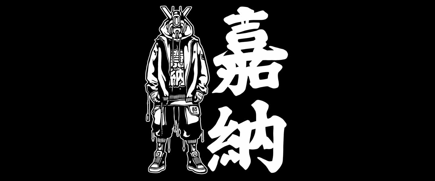
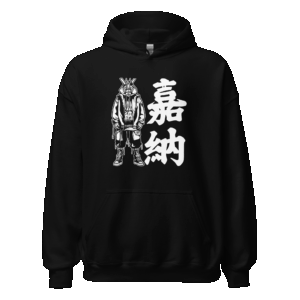
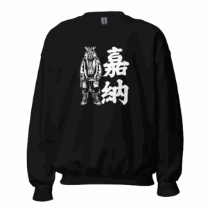
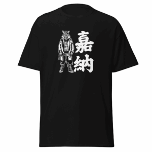
    Among these three robots, one gradually evolved into a more personal character: RoboKano. Recognisable by his oversized hoodie and calm expression, RoboKano carries the vertical 嘉納 kanji alongside him, the same kanji i used in Argenteuil. These characters reference both my artist name, Kanos, and Jigoro Kano, the founder of judo, whose philosophy of continuous improvement, discipline and respect has long inspired me.

    Rather than simply creating another robot, I wanted to develop a mascot capable of representing my artistic identity across different media. RoboKano combines elements of Japanese visual culture, contemporary illustration and cyberpunk aesthetics while remaining friendly and accessible. His design avoids exaggerated aggression often associated with robotic characters. Instead, he embodies curiosity, resilience and quiet determination. He feels less like a machine built for combat than a travelling companion carrying stories from one artistic project to another.

    The clean white background allows the character to stand alone, emphasizing his silhouette and graphic details without distraction. It also reinforces his role as an independent illustration rather than a scene extracted from a larger narrative.

    The Robokano Illustrations is available as a Totebag, Hoodie, Sweatshirt and T-Shirt for those who want to wear this original cyberpunk design. Browse the complete collection below.

    RoboKano cyberpunk robot illustration with Kano kanji

    Dark RoboKano

    After developing the original illustration, I wanted to explore how atmosphere alone could transform the perception of the same character. Dark RoboKano uses an identical design but places it against a deep black background. This simple change dramatically alters the visual impact. Metallic details become more pronounced, contrasts appear stronger, and the robot takes on a more cinematic presence. Although the illustration remains fundamentally the same, the darker version feels more mysterious and closer to classic cyberpunk imagery.

    It demonstrates how colour, light and negative space can completely redefine the emotional reading of a character without changing its design. Rather than replacing the original version, Dark RoboKano complements it, offering collectors two different interpretations of the same visual identity.

    The Dark Robokano Illustrations is available as a Totebag, Hoodie, Sweatshirt and T-Shirt for those who want to wear this original cyberpunk design. Browse the complete collection below.

    Dark RoboKano cyberpunk robot illustration on black background

    Robots as Companions Rather Than Machines

    Robots have accompanied science fiction for more than a century, evolving from industrial workers to complex fictional personalities capable of expressing emotions, intelligence and individuality. My own interpretation follows this evolution. Rather than depicting machines that dominate humanity, I prefer imagining robots that accompany it. They become travelling companions, guardians, assistants and silent witnesses to the adventures experienced by the characters inhabiting my cyberpunk universe.

    Whether painted on monumental murals or transformed into illustrations, apparel and prints, these robots contribute to a larger visual narrative that continues to expand with every new project. They remind us that the future is not only built from technology but also from the stories we choose to tell through it.

    Frequently Asked Question

    What inspired these cyberpunk robot illustrations?

    The series was created for The Road Warriors, an ongoing artistic project by Alex Kanos and Sloke. The robots were imagined as companions to the cyberpunk heroines that appear throughout Alex Kanos’ visual universe.

    Why do the robots wear hoodies and streetwear?

    Rather than designing futuristic machines isolated from contemporary culture, the robots wear clothing inspired by modern streetwear to connect today’s urban aesthetics with speculative science-fiction worlds.

    Who is RoboKano?

    RoboKano is an original character created by Alex Kanos. The vertical 嘉納 kanji refers both to the artist’s name, Kanos, and to Jigoro Kano, founder of judo, whose philosophy has inspired the artist for many years.

    Why is there a Dark RoboKano version?

    Dark RoboKano explores how a simple change of background and atmosphere can completely transform the perception of the same illustration, creating a more cinematic and cyberpunk mood.

    Are these illustrations available as products?

    Yes. The robot illustrations are available as official products including Fine Art Prints, Hoodies, Sweatshirts, T-Shirts, and selected designs are also available as Totebags.


  • GRAPHIC DESIGN ST-GERMAIN 2023

    Graphic design by Alex KANOS
    Organised by Osaro Agency
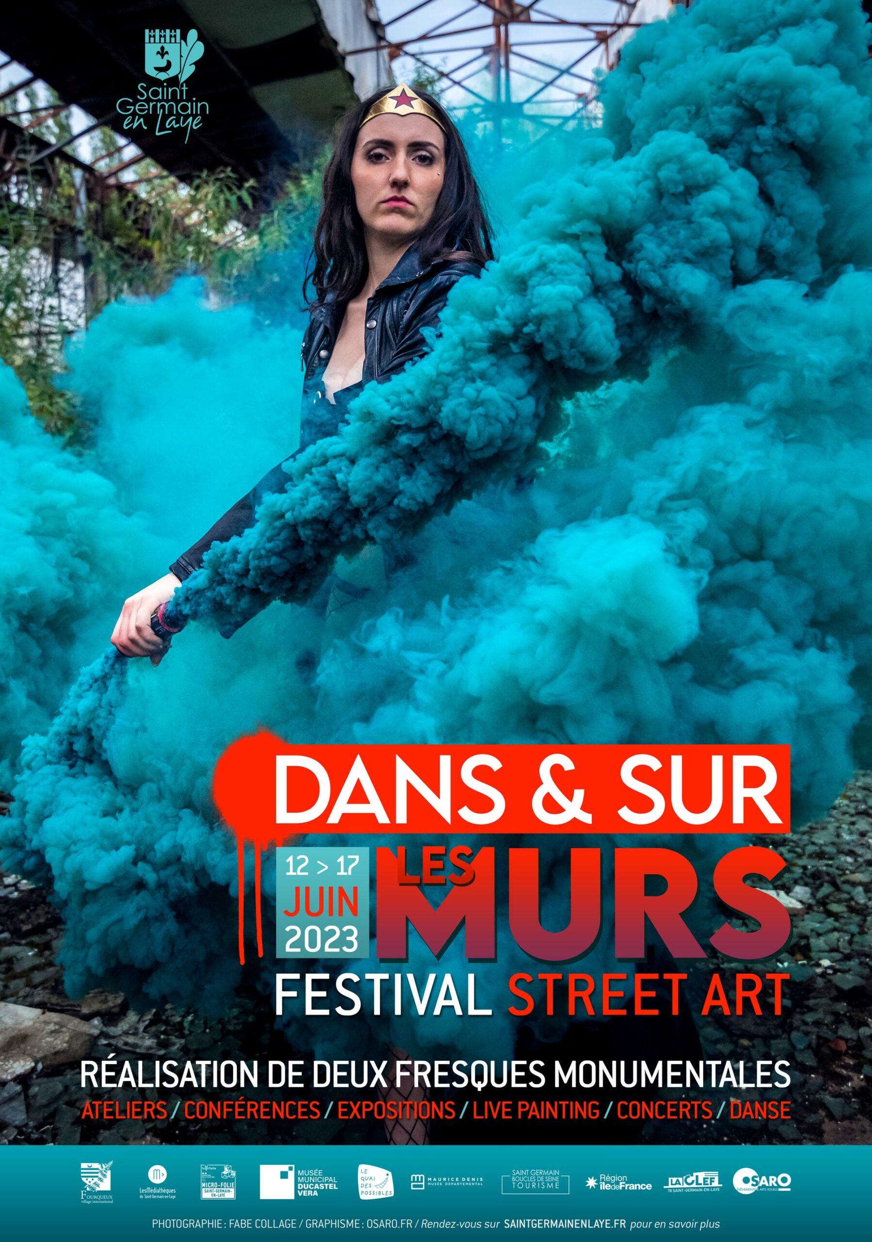
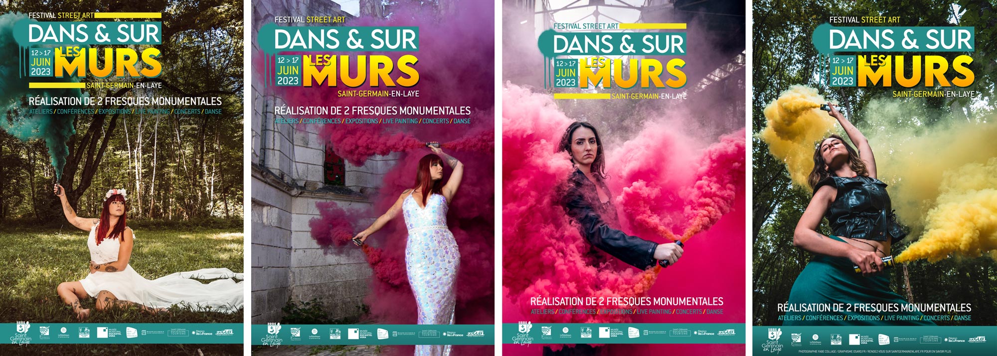
    Poster Graphic Design for Saint-Germain-en-Laye 2023
    poster purpose Graphic Design for Saint-Germain-en-Laye 2023
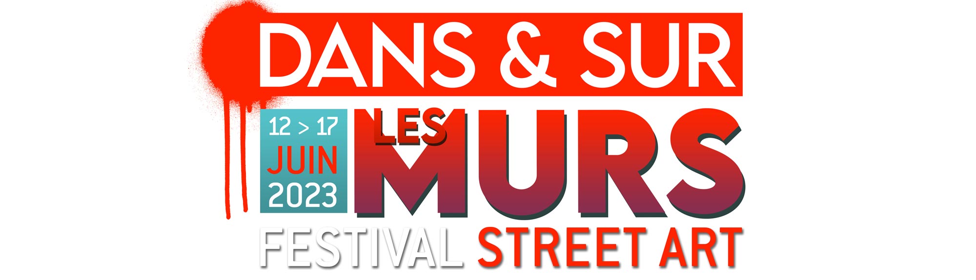
    Logo Graphic Design for Saint-Germain-en-Laye 2023
    Sign Logo Graphic Design for Saint-Germain-en-Laye 2023

    Frequently Asked Questions

    What is the “Dans et sur les murs” project?
    It is a street art event in Saint-Germain-en-Laye for which Alex Kanos created the 2023 poster and urban panels.

    What was the main visual inspiration?
    The design is based on a photograph by Fabe Collage showing a woman holding a smoke flare.

    What was added besides the poster?
    A series of graphic panels displayed in the city using photographs from Fabe Collage and Saint-Germain-en-Laye.

    What is the concept behind the project?
    The project extends graphic design into public space, transforming communication into urban visual installation.

    Who organized the event?
    The event was organized by Saint-Germain-en-Laye City Hall.

    “Dans et sur les murs” Graphic Poster for Street Art event in Saint-Germain-en-Laye

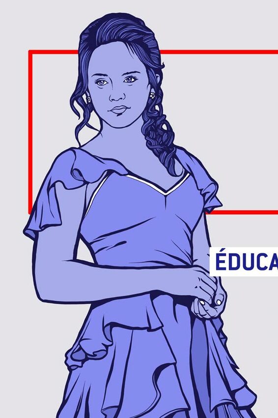
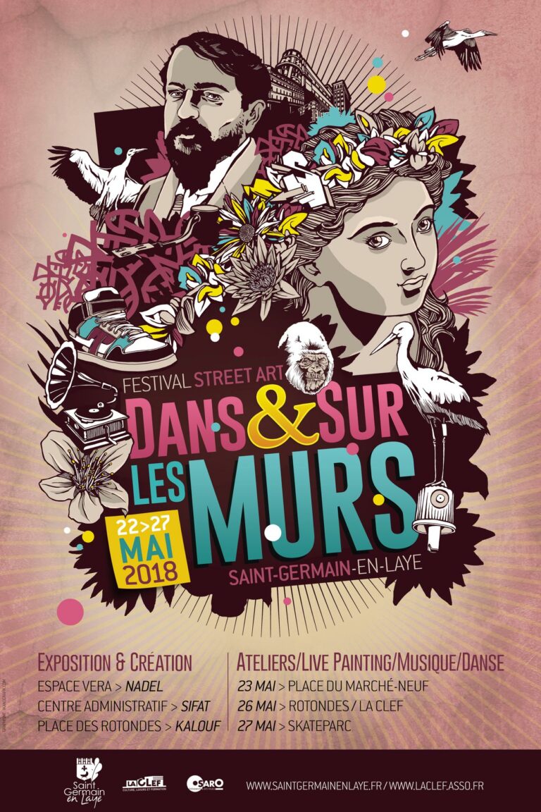
    In 2023, I had the honor to work again for Saint-Germain-en-Laye Cityhall as i did in 2018, creating the new graphic poster for their street art event. This time, I decided to use a powerful photograph by Fabe Collage featuring a woman holding a smoke flare. The image highlights urgency of rebellion, echoing the spirit of urban art movements.

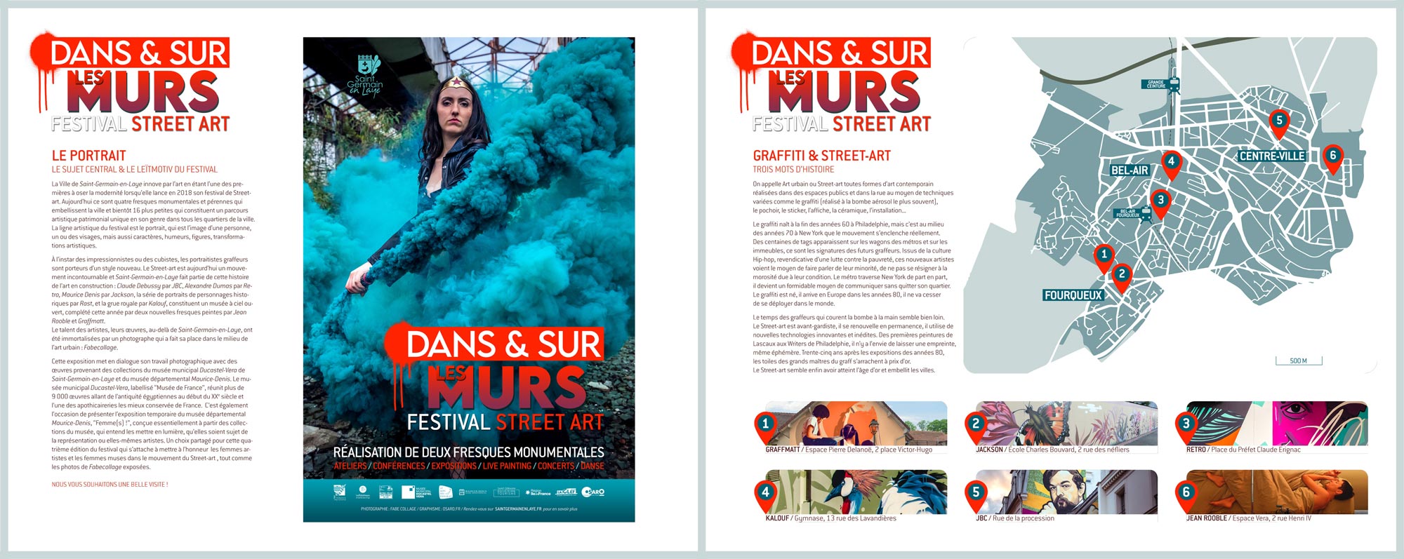
    Alongside the poster design, I also created a series of panels using more of Fabe Collage‘s photographs and also photograph’s found from the city of Saint-Germain-en-Laye. These panels were displayed in the urban space, extending the visual identity of the event and integrating it into the urban landscape.

    This project is rooted in the intersection between graphic design, photography and urban intervention. The objective was not only to create a promotional poster, but also to extend the visual identity of the event into the public space itself. The design becomes a bridge between communication and urban experience.

    The choice of the photograph by Fabe Collage is central to the visual impact of the project. The image of a woman holding a smoke flare introduces a strong emotional and symbolic dimension. It evokes urgency, resistance and collective energy, elements often associated with street art culture and urban expression.

    Rather than using a purely illustrative approach, the design is built from documentary and photographic material. This decision reinforces the connection between reality and artistic interpretation. The visual language is grounded in real urban scenes and real individuals, which strengthens the authenticity of the message.

    The “Dans et sur les murs” event in Saint-Germain-en-Laye provided a context where graphic design could interact directly with urban space. The project extended beyond the poster itself, incorporating additional panels displayed in the city. These panels used a combination of photographs from Fabe Collage and archival images sourced from Saint-Germain-en-Laye, creating a layered visual narrative.

    This expansion into public space transforms the design into an environmental installation. Instead of being confined to a single surface, the artwork becomes part of the city’s visual ecosystem. It interacts with architecture, circulation and everyday urban life.

    The integration of multiple photographic sources creates a dialogue between different perspectives of the city. On one hand, there is the artistic vision of Fabe Collage, focused on expressive human presence. On the other, there are documentary images of Saint-Germain-en-Laye, which anchor the project in its geographical reality.

    This combination reinforces the idea that urban space is not static but constantly evolving. Street art and graphic design contribute to this evolution by introducing temporary visual interventions that reshape perception of familiar environments.

    The project also reflects a broader interest in how visual identity can be extended beyond traditional formats. A poster is usually a fixed communication tool, but in this case, it becomes the starting point for a larger system of visual expression distributed across public space.

    Through this approach, the boundary between design and installation becomes blurred. The viewer is not only exposed to a message but also immersed in a coherent visual environment that extends throughout the city.

    Ultimately, this project for Saint-Germain-en-Laye demonstrates how graphic design can operate at the intersection of communication, photography and urban art. It shows how a visual identity can be expanded into space and time, creating a dynamic relationship between artwork, audience and environment.


Graphic Design

Graphic design and Visual Identity

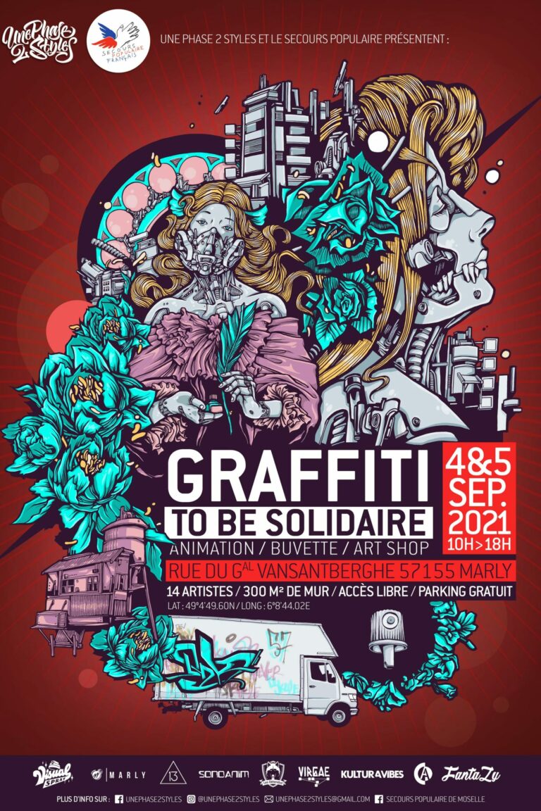
Graphic design has always been an essential part of my artistic practice. Long before becoming a full-time mural artist, I studied graphic design alongside fine arts school, developing a multidisciplinary approach where illustration, typography, photography and visual communication naturally intersect.

Rather than treating graphic design as a separate discipline, I consider it another way of constructing visual narratives. Whether designing a festival identity, an exhibition poster or a complete communication campaign, my objective remains the same: creating meaningful images that combine artistic expression with clear communication.

Today, I develop graphic design projects for municipalities, cultural institutions, associations, festivals and private organisations, combining artistic creativity with professional communication strategies.

Graphic Design Philosophy

My graphic work is built upon the same visual principles that define my murals. Composition comes before decoration. Narrative comes before style.

Very inspiring by El Lissitzky, each of my project begins with understanding the purpose of the communication before searching for its visual expression.

The visual identity must not simply look attractive; it must communicate ideas, reinforce recognition and remain coherent across different media.

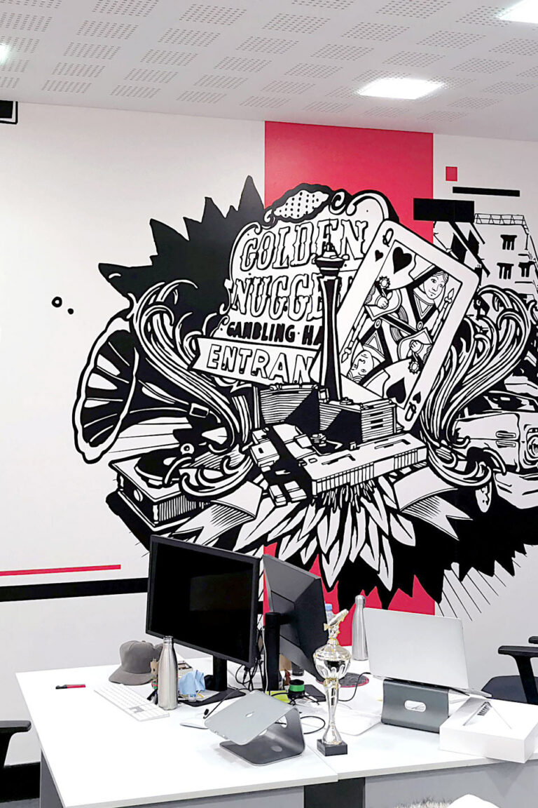
Because of my background in mural painting, I naturally think at multiple scales. A poster, a brochure, a billboard or a monumental wall all require similar compositional logic despite their different formats.

This multidisciplinary perspective allows me to create identities capable of existing consistently across print, digital media and public space.

Visual Identity

Creating a visual identity means defining the personality of an event, institution or project through graphic language.

This includes typography, colour systems, illustrations, layouts and visual hierarchy.

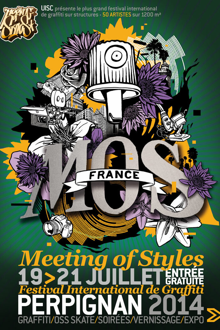
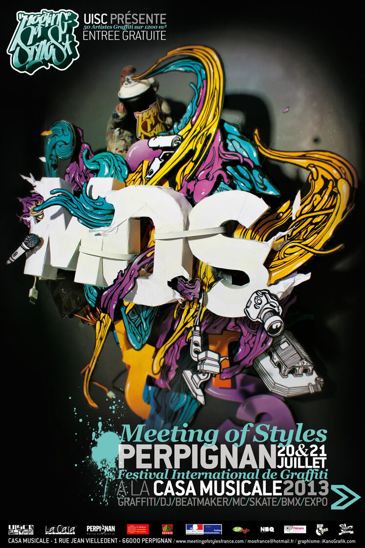
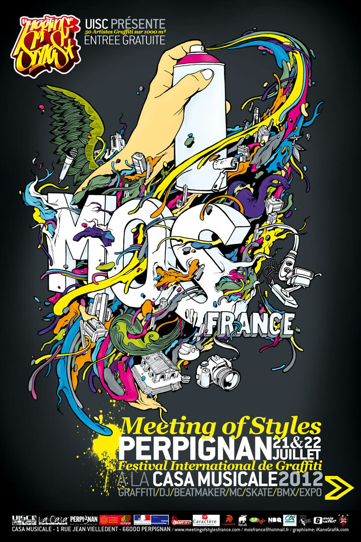
One example is my long-term collaboration with Meeting of Styles France, where I developed the complete visual identity for several editions of the international graffiti festival.

Rather than producing isolated posters, the objective was to build a coherent communication system applicable across every medium: posters, flyers, banners, digital communication and on-site graphics.

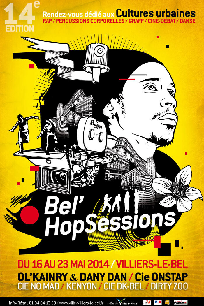
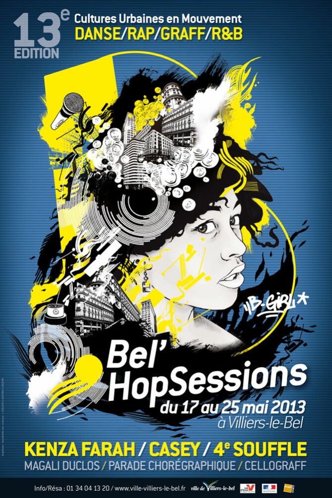
A similar approach guided my work for BelHopSession, where the visual identity evolved over several consecutive editions while preserving immediate recognition.

Posters and Cultural Communication

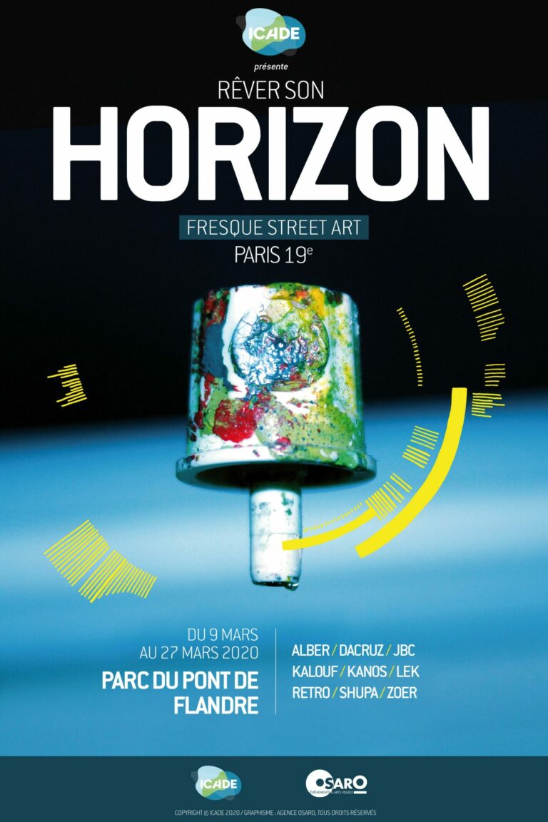
Poster design remains one of my favourite graphic disciplines because it combines illustration, typography and storytelling within a single composition.

Many of my commissions have involved cultural communication for municipalities and public institutions.

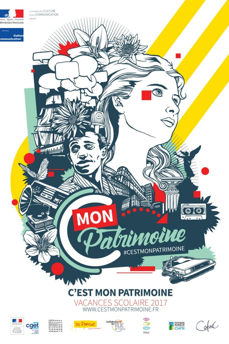
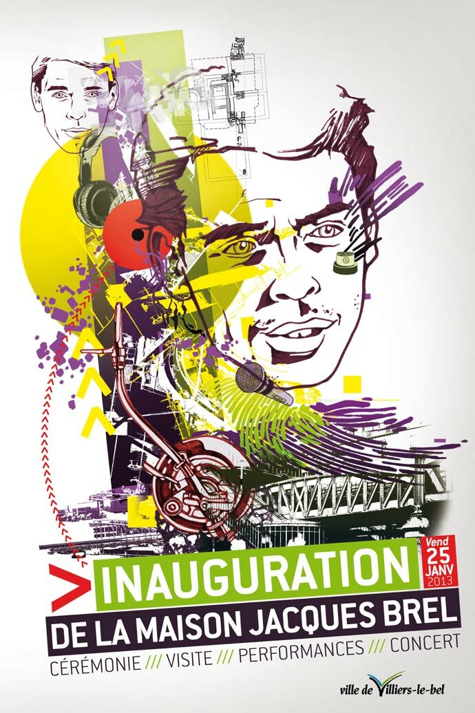
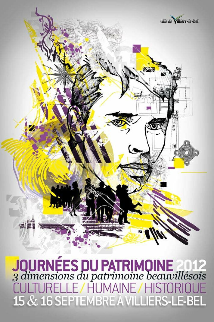
Projects developed for Villiers-le-Bel, including the Jacques Brel inauguration and Patrimony Day, demonstrate how graphic design can connect local history, architecture and contemporary visual language.

Similarly, the Baseball France Challenge identity required balancing institutional communication with dynamic sports imagery, creating visuals capable of attracting both participants and spectators.

Each poster becomes more than an announcement; it functions as a visual identity for the event itself.

Illustration and Experimental Design

Alongside commissioned work, I continue developing personal graphic research.

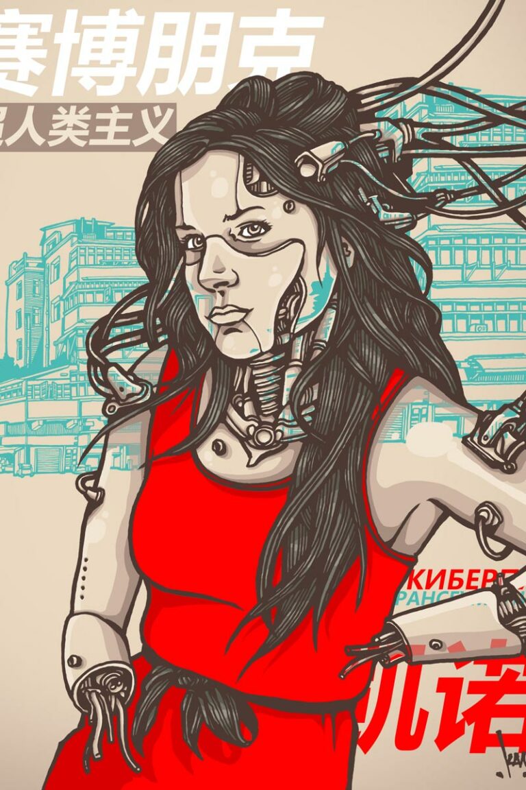
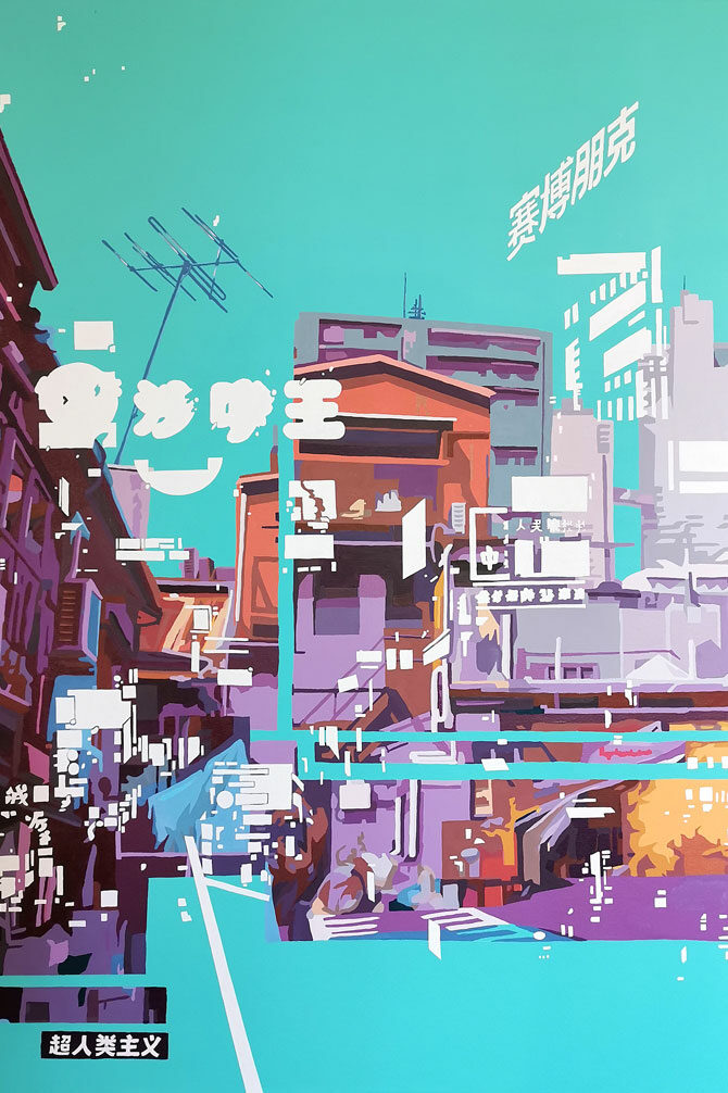
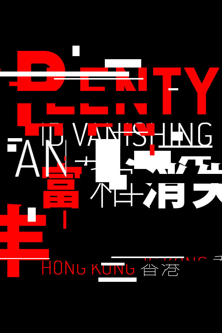
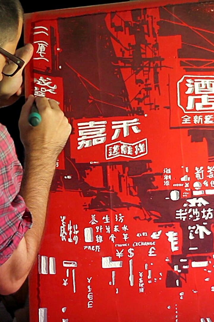
Projects such as Plenty Vanishing in Hong Kong explore graphic composition beyond traditional communication, questioning the accumulation and disappearance of visual signs within contemporary cities.

These experimental projects directly influence my commissioned work by expanding my understanding of composition, abstraction and visual rhythm.

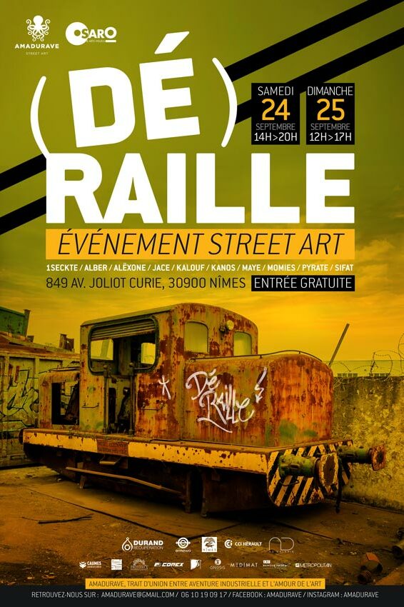
Editorial projects such as Déraille also allowed me to explore typography, layout and publication design while maintaining a strong artistic identity.

This dialogue between experimentation and professional commissions is one of the foundations of my practice.

Public Institutions and Cultural Projects

Over the years I have collaborated with municipalities, cultural organisations, festivals and public institutions across France.

These collaborations require balancing artistic creativity with practical communication objectives.

Visual identities must remain accessible while expressing a distinctive personality.

Campaigns often extend across multiple formats including posters, brochures, exhibition panels, social media visuals, banners and environmental graphics.

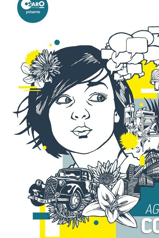
Recent public commissions, including projects for Saint-Germain-en-Laye, continue this approach by combining contemporary illustration with institutional communication.

From Concept to Delivery

Every graphic design project follows a structured workflow. Research begins with understanding the objectives and audience.

Concept development follows through sketches, visual references and compositional studies.

Digital production then transforms these ideas into coherent communication systems suitable for print and digital media.

Throughout the process, particular attention is paid to typography, hierarchy, readability and consistency.

The final objective is always the same: producing visual communication that remains memorable long after the event or campaign has ended.

Frequently Asked Questions

What graphic design services do you provide?

Visual identity, posters, illustration, editorial design, branding and communication for cultural and public projects.

Do you only work for cultural organisations?

No. I collaborate with municipalities, companies, associations and private clients.

Can you create both the design and the illustrations?

Yes. My projects often combine original illustration, typography and graphic design into a single visual identity.

Do your graphic projects follow the same artistic style as your murals?

No. I can create with differents tools and visual language like photos but a lot of my projects share the same identity inspired by cyberpunk and graffiti.

Can you create a complete communication campaign?

Yes. I can design visual identities across multiple media including posters, brochures, banners, digital communication and exhibition graphics.