
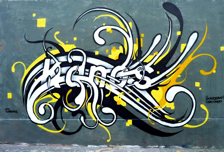
Kanornement 2011
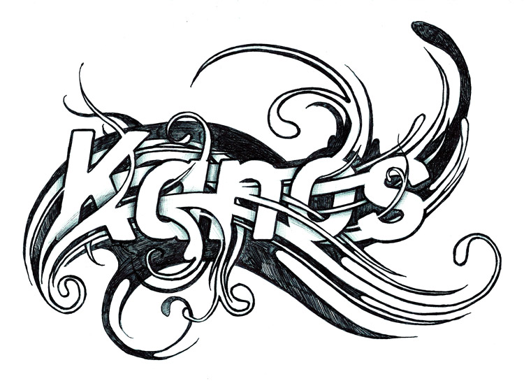
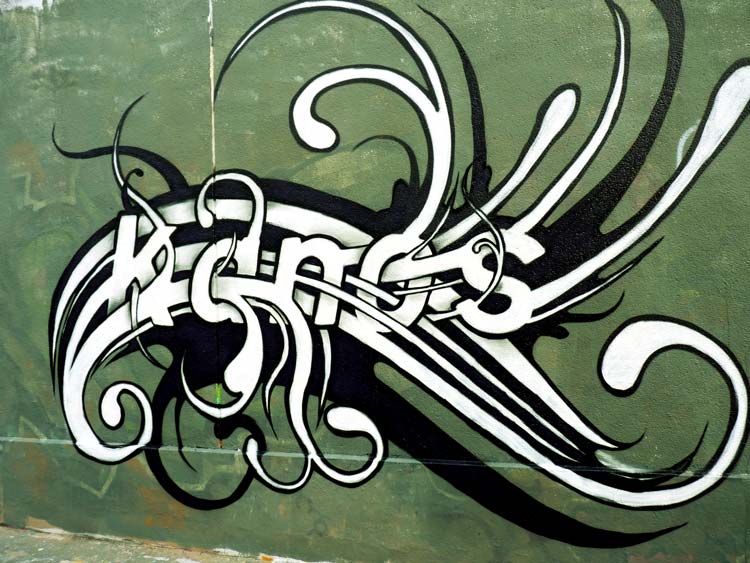
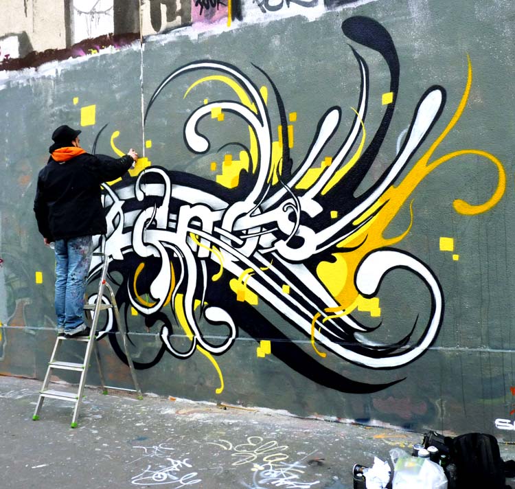
Kanornement 2011 documents a graffiti mural painted on Rue des Pyrénées in Paris during a period of intensive research into typography and graphic composition. While my previous works were already focused on developing the lettering of my name, this project shifts the emphasis toward ornamentation. Rather than transforming the structure of the letters themselves, the objective becomes the visual language that surrounds them and gives them rhythm, balance and depth.
Graffiti has traditionally been associated with lettering, where style is often defined by the construction and deformation of the characters. In this project, however, I wanted to move beyond the letters alone and investigate how ornament could become an integral part of the composition. Instead of functioning as decorative additions, the ornamental elements participate in the overall structure of the mural and contribute to its visual identity.
The word “Kanornement” reflects this intention. It combines my artist name with the idea of ornament, expressing a stage of research where typography and decorative graphic systems begin to merge. The mural therefore occupies a position somewhere between graffiti writing, illustration and graphic design.
At this stage of my work, I was increasingly interested in expanding graffiti beyond its conventional visual vocabulary. Rather than treating the letters as isolated objects, I wanted to create complete graphic compositions in which typography, ornamental structures and visual rhythm would interact as equal components.
The composition is deliberately asymmetrical. Instead of centring the lettering within the wall, the different elements are distributed in a way that creates movement across the entire surface. Empty spaces become just as important as painted areas, allowing the eye to travel through the mural without following a rigid or symmetrical organisation.
This asymmetrical construction would later become an important characteristic of many subsequent projects. It allowed the compositions to feel more dynamic while creating opportunities to integrate additional symbolic and architectural elements without disrupting the balance of the overall image.
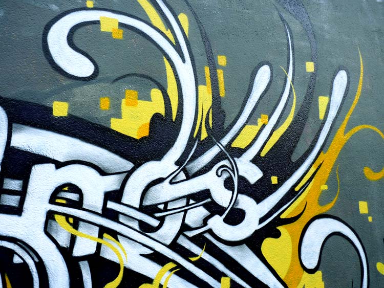
The colour palette is intentionally restrained. Black and white dominate the mural, while a limited touch of yellow introduces contrast and guides the viewer through the composition. Restricting the number of colours shifts the attention away from chromatic effects and places greater emphasis on structure, line, texture and graphic relationships.
This reduced palette also recalls visual traditions found in graphic design, printmaking and editorial illustration, where limited colours are often used to maximise contrast and visual impact. The result is a composition that moves closer to graphic design while remaining firmly rooted in graffiti practice.
Another important aspect of this research is the growing influence of ornamental forms inspired by engraved illustrations and decorative graphic systems. At this point, I began integrating ornamental motifs into the composition as structural elements rather than decorative embellishments.
Some of these ornamental details anticipate ideas that would later become central to my Kanos le billet d’un dollar series. While the dollar bill is not yet the explicit subject of the work, certain engraved-inspired motifs already begin to appear. These visual references would later evolve into a much more comprehensive exploration of economic symbolism, currency imagery and engraved graphic language.
In retrospect, Kanornement 2011 represents a transitional project. It bridges earlier typographic research and later conceptual developments by introducing a new way of organising visual information. The mural demonstrates that ornament can become part of the narrative structure of graffiti rather than remaining a secondary decorative layer.
The work also reflects my long-standing interest in combining different visual disciplines. Graffiti provides the foundation through lettering and spray paint, while graphic design contributes compositional balance, hierarchy and rhythm. Ornament then acts as the connecting language that unifies these different approaches into a coherent visual system.
Painted on Rue des Pyrénées, one of the most active graffiti locations in Paris during that period, the mural also belongs to a broader urban context where artists constantly experimented with new forms of lettering and composition. The constantly changing walls encouraged visual innovation, making the location an important laboratory for stylistic development.
Looking back today, this project clearly announces several directions that would define my later work. The asymmetrical compositions, engraved-inspired ornaments, structured typography and restrained colour palette all reappear in subsequent murals and studio projects. Most importantly, Kanornement 2011 introduces the ornamental vocabulary that would soon expand into the larger conceptual framework of the Kanos le billet d’un dollar series, where typography, architecture, economic symbolism and graphic ornamentation become fully interconnected.
Frequently Asked Questions
What is Kanornement 2011?
It is a graffiti mural exploring the relationship between typography, ornamentation and graphic design through the lettering of the name Kanos.
Where was Kanornement 2011 painted?
The mural was painted on Rue des Pyrénées in Paris, one of the city’s best-known graffiti locations at the time.
Why is ornament important in this project?
The ornamental elements become part of the composition itself, helping structure the mural rather than simply decorating the letters.
Why are only black, white and yellow used?
The limited palette emphasises composition, contrast and graphic structure while bringing the work closer to graphic design aesthetics.
How does this project connect to later works?
It introduces the asymmetrical compositions and engraved-inspired ornaments that would later become central to the Kanos le billet d’un dollar series.