

Réalisation de la communication de l’événement Bel’HopSession pour le service culturel de la ville de Villiers-le-Bel dans le Val d’Oise.
belhopsession villiers-le-bel 2011 / First Edition
belhopsession Villiers-le-Bel 2011 documents the creation of the visual identity, official poster and graphic communication for the first edition of the BelHopSession festival in 2011. Commissioned by the City of Villiers-le-Bel, the project was designed to promote a cultural event dedicated to hip hop while creating a strong visual identity capable of representing the diversity of the movement. This first collaboration would later lead to the graphic design of the 2012, 2013 and 2014 editions, establishing a long-term relationship with the municipality and its cultural programme.
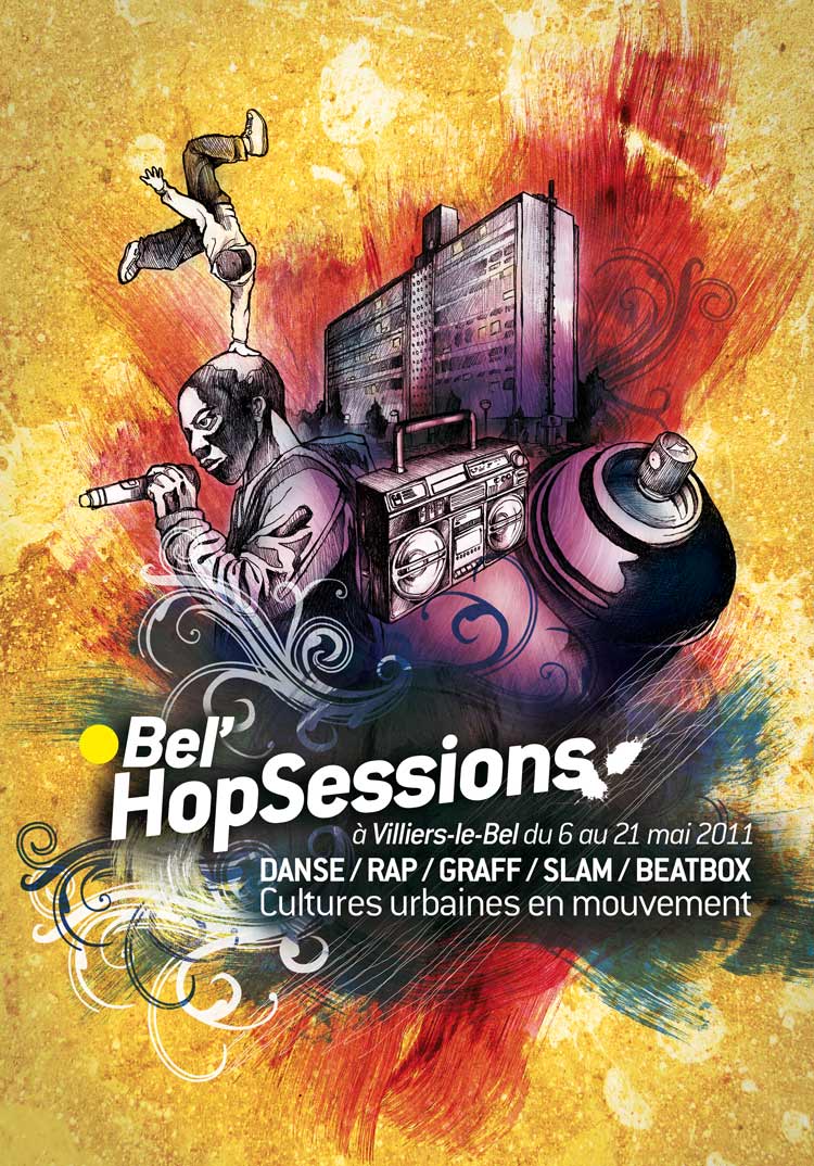
The objective was not simply to design an event poster but to create a complete visual language that reflected the history and energy of hip hop culture. From the beginning, I wanted the artwork to sit somewhere between graffiti, illustration and graphic design, allowing these different disciplines to coexist within the same composition.
The poster is built around several figures representing key elements of hip hop culture. One of the central characters is a singer holding a microphone, referring directly to live performances and rap concerts programmed during the festival. Music remains one of the four historical pillars of hip hop culture, making the presence of the performer an essential element of the composition.
Alongside the vocalist appears a breakdancer captured in motion. The dancer introduces movement and rhythm into the image while representing another fundamental discipline of hip hop culture. Rather than illustrating a single performance, the figure symbolizes the physical expression and creative freedom associated with breaking.
The urban setting surrounding these characters is composed of buildings inspired by the city of Villiers-le-Bel. Instead of using anonymous architecture, I redrew local buildings to anchor the festival within its own environment. This connection between cultural identity and urban space was important because the event was created for the local community while remaining open to wider audiences.
The architecture therefore becomes more than a background. It reinforces the relationship between the festival and the city itself, reminding viewers that hip hop has always maintained a strong dialogue with the urban environments in which it develops.
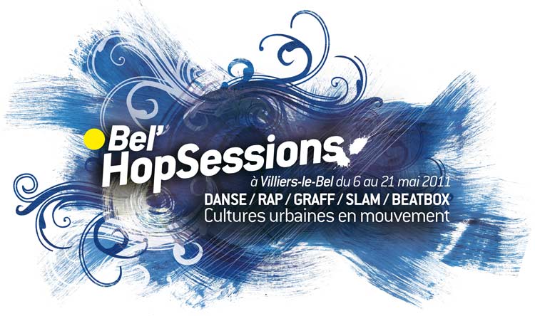
Typography also became an important part of the composition. Rather than placing the title as a separate graphic element, I developed a typographic treatment that interacts with the illustration and contributes to the overall rhythm of the poster. The lettering was designed to echo graffiti aesthetics while remaining readable for public communication.
Another significant aspect of the visual identity is the use of textured painted backgrounds. Instead of relying exclusively on digital graphic elements, I incorporated painted surfaces and material effects that evoke spray paint and wall textures. This decision was intended to establish an explicit visual reference to graffiti, which remains one of the founding disciplines of hip hop culture.
Several symbolic objects reinforce this connection. A spray can appears within the composition as a direct reference to graffiti writing and mural painting. Rather than functioning as a decorative accessory, it acknowledges graffiti as an essential component of the cultural movement celebrated by the festival.
Another recurring object is the ghetto blaster. This iconic portable cassette player became one of the defining symbols of hip hop during the late 1970s and throughout the 1980s. It evokes the origins of street parties, public performances and breakdance sessions that helped shape the movement during its early years. Including this object creates a visual bridge between the festival and the historical roots of hip hop culture.
The overall composition therefore combines architecture, music, dance, graffiti and typography into a single coherent visual identity. Rather than highlighting only one aspect of hip hop, the project presents the movement as a multidisciplinary culture where different artistic practices coexist and influence one another.
This first edition also marked the beginning of an ongoing collaboration with the City of Villiers-le-Bel. Following the success of the initial visual identity, I was commissioned to create the communication for BelHopSession in 2012, 2013 and 2014. These successive editions allowed the graphic language to evolve while preserving a strong visual continuity from one year to the next.
Beyond BelHopSession, this collaboration extended to other municipal cultural projects. I later designed the visual communication for the inauguration of the Maison Jacques Brel and for the Patrimoine Days programme in Villiers-le-Bel. These projects demonstrate how a long-term collaboration can create a consistent visual dialogue between cultural events while adapting each identity to its own subject and audience.
Looking back, belhopsession villiers le bel represents the starting point of several years of graphic collaboration. It combines illustration, graffiti, typography and urban references into a visual identity that celebrates hip hop culture while remaining closely connected to the city where the festival was born.
Frequently Asked Questions
What is BelHopSession Villiers-le-Bel?
It is the first edition of the BelHopSession hip hop festival held in Villiers-le-Bel in 2011.
What did you create for the festival?
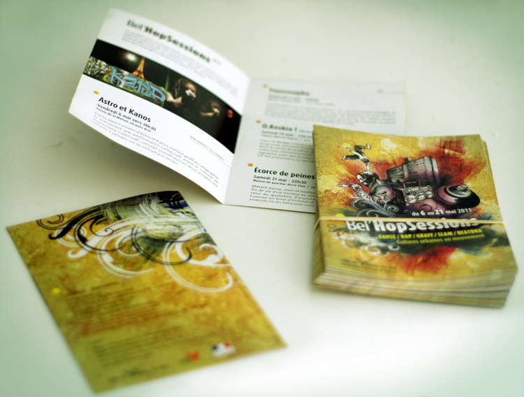
I designed the complete visual communication, including the official poster, graphic identity and promotional materials.
What elements appear in the poster?
The artwork features local architecture, a rapper, a breakdancer, graffiti-inspired typography, a spray can and a ghetto blaster representing the roots of hip hop culture.
Did you work on later editions of BelHopSession?
Yes. I also created the graphic design and communication for the 2012, 2013 and 2014 editions.
Did this collaboration lead to other projects?
Yes. It was followed by commissions for the inauguration of Maison Jacques Brel and the European Heritage Days visual identity in Villiers-le-Bel.