
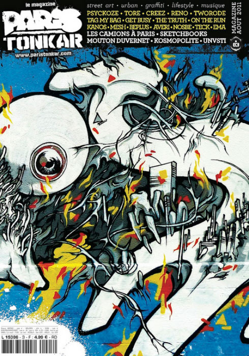
Paris Tonkar Cover by Alex Kanos
Paris Tonkar is a French magazine dedicated to graffiti, street art, hip hop culture, and urban visual expression. It has played a significant role in documenting the evolution of graffiti culture in France and internationally, featuring artists, crews, murals, and urban art practices across different generations.
Being featured on the cover of Paris Tonkar represents a form of recognition within the graffiti and street art community, as the magazine is widely known for its documentation of writers, muralists, and urban interventions.
The cover image used for this issue is a detail from one of my graffiti pieces painted in Paris, specifically on Rue des Pyrénées. The composition focuses on a stylized letter “S” painted in white on a blue background. This fragment was selected for its visual intensity and its ability to encapsulate the different layers of my graphic language within a single cropped section of a larger mural.
The image reflects several recurring elements present in my work. At its core, the piece is based on typography, but the letterform is not treated as a pure sign. Instead, it becomes a structure onto which other visual systems are attached and intertwined.
Organic forms are integrated into the letter, creating fluid transitions between structure and distortion. These elements introduce a sense of growth and transformation, as if the letter itself were evolving or being affected by external forces.
Mechanical references are also present, embedded within the composition. These fragments suggest industrial structures, constructed systems, and engineered forms. Their presence creates a tension between natural growth and manufactured order.
Architectural fragments appear throughout the piece, with portions of buildings and urban structures integrated into the letterform. These elements evoke a fragmented cityscape, where architecture is broken down and reassembled within the graffiti structure itself.
In addition, more visceral elements such as teeth are incorporated into the composition. These organic details introduce a raw, almost anatomical dimension to the work. They interact with the surrounding architectural and mechanical elements, reinforcing the hybrid nature of the visual language.
Another key feature of the composition is the transformation of the letter “O” into an eye-like structure. This element introduces a perception-based reading of the work, suggesting observation, surveillance, or introspection. It also reinforces the idea that letters can function as living or perceptual forms rather than static symbols.
The combination of these elements—typography, organic structures, mechanical references, architectural fragments, and anatomical details—defines the core visual identity of this piece and by extension a significant part of my graffiti practice during this period.
The selection of this image as a cover for Paris Tonkar highlights the editorial interest in graffiti that pushes beyond traditional lettering into more complex visual systems. The magazine has historically featured artists who expand the boundaries of graffiti writing, and this publication continues that tradition by presenting works that combine technical skill with experimental visual language.
This cover was made possible through the support of Tarek, to whom I extend my thanks for including my work in this issue of the magazine. Being featured in Paris Tonkar represents an important moment in the documentation and dissemination of this specific piece within the broader graffiti and street art context.
The publication situates the work within a larger historical and cultural framework, connecting it to the ongoing evolution of graffiti in France and its dialogue with international urban art practices.
Frequently Asked Questions
What is Paris Tonkar?
Paris Tonkar is a French magazine dedicated to graffiti, street art, and hip hop culture, documenting artists and urban visual practices.
Where does the cover artwork come from?
The cover is a detail from a graffiti piece painted in Paris on Rue des Pyrénées.
What elements are present in the cover image?
The composition includes a stylized letter S, organic and mechanical forms, architectural fragments, teeth-like elements, and a letter O transformed into an eye.
Why was this artwork selected for the cover?
It represents a dense visual synthesis of the artist’s graffiti style combining typography, urban fragments, and hybrid organic/mechanical systems.
Who is thanked for this publication?
Thanks are given to Tarek for featuring the work on the cover of Paris Tonkar magazine.